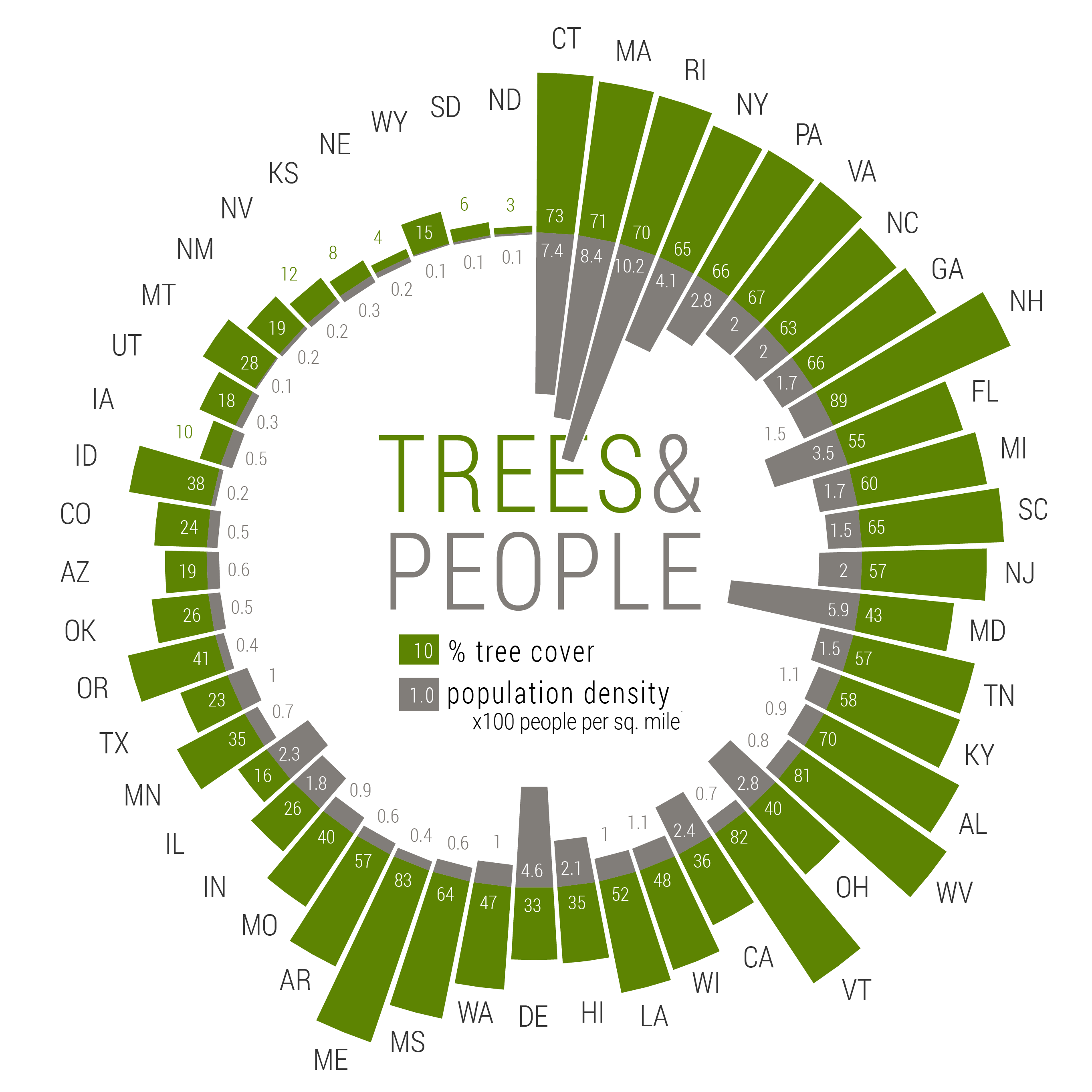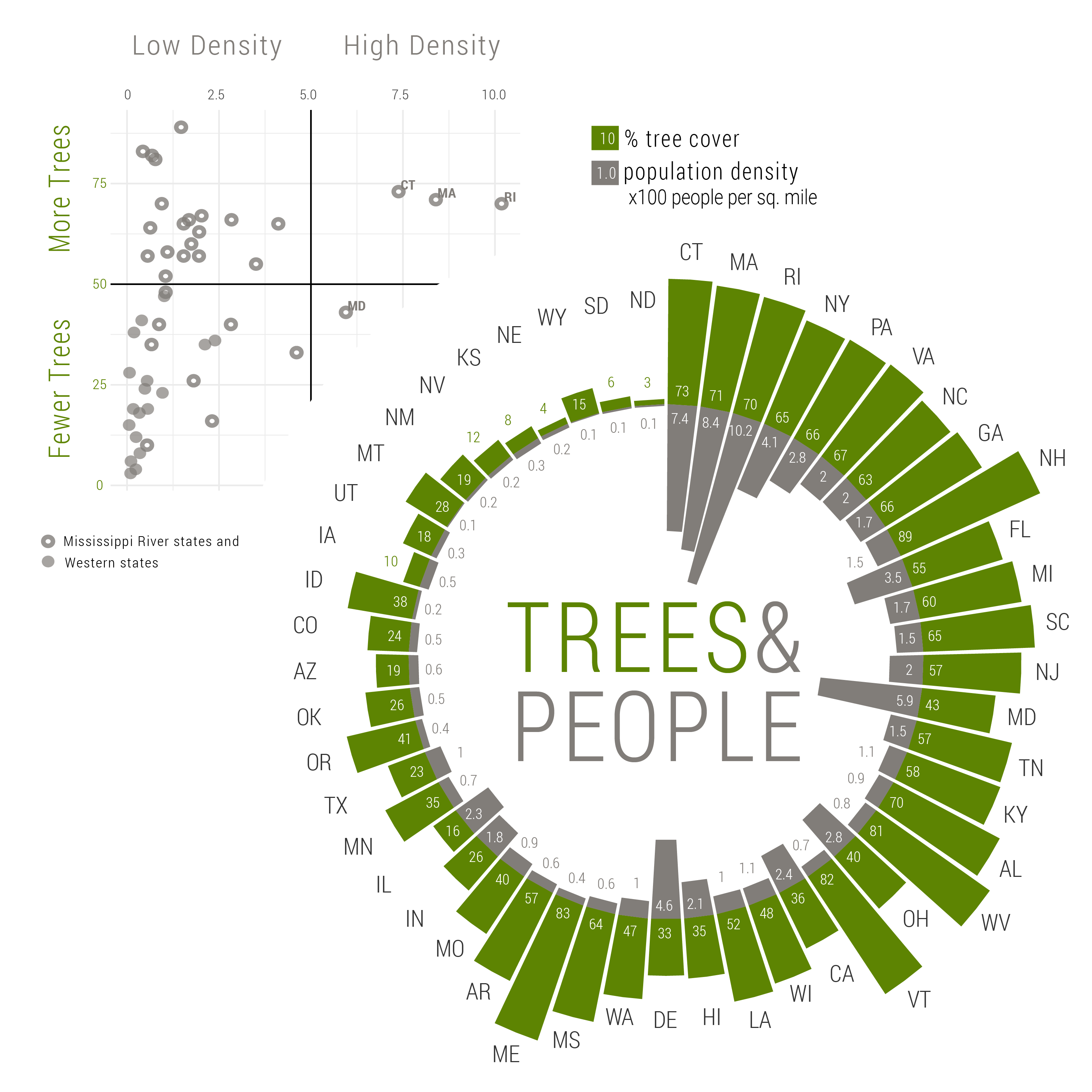
Among other topics, my lab studies the relationship between forest obligate frogs and urbanization. During a seminar, I once heard my advisor mention that Connecticut is the perfect state for us because the state sits a the top of the rankings for both the greatest percentage of tree cover and highest population density.
I’ve been meaning to dig into that statement for a while, so when Storytelling With Data encouraged folks to submit radial graphs for their July #SWDchallenge, I took the opportunity.
I pulled the population data from the US Census Bureau and used “People per sq. mile” from the 2010 census for density estimates. The tree cover data came from Nowak and Greenfield (2012, Tree and impervious cover in the United States. Landscape and Urban Planning).
Here’s how I made the graphic:
library(tidyverse)

TP <- read.csv("C:\\Users\\Andis\\Google Drive\\2019_Summer\\TreePop\\CanopyVsPopDensity.csv", header = TRUE) %>% select(State, Perc.Tree.Cov, Pop.Den.) %>% rename(Trees = Perc.Tree.Cov, Pop = Pop.Den.) %>% filter(State != "AK")

> head(TP)
  State Trees   Pop
1    AL    70  94.4
2    AZ    19  56.3
3    AR    57  56.0
4    CA    36 239.1
5    CO    24  48.5
6    CT    73 738.1
>
Here is the dataset. First we rename the variables and removed Alaska since it was not included in the tree cover dataset.
ggplot(TP, aes(x = State, y = Trees)) +
  geom_col()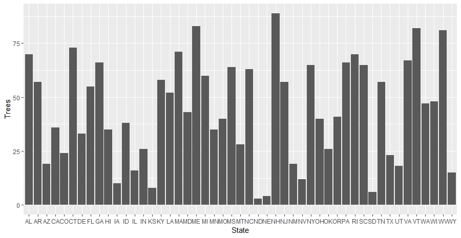
This gives us a column or bar plot of the percent tree cover for each state. Note that we could also use geom_bar(), but geom_col() will be easier to deal with once we start adding more elements to the plot.
Mirrored bar charts are a great way to compare two variables for the same observation point, especially when the variables are in different units. However, we still want to make sure that the scales are at least pretty similar for aesthetic symmetry. In our case, we will actually be asking ggplot to use the same unit scale for both tree cover and population density, so we need to make sure that they are very similar in scale.
The best option would be to standardize both values of tree cover and population density to a common scale by dividing by the respective standard deviation. The problem comes in interpreting the axis because the scale is now in standard deviations and not real-world units.
For this graphic, I’m going to cheat a little. Since we will eventually be removing our y-axis completely, we can get away with our values being approximately congruent. Since tree cover is a percentage up to 100, I decided to simply scale population density to a similar magnitude.
The greatest Population Density is Rhode Island with 1018.1 people per square mile. We can divide by 10 to make this a density in units of “10 people per square miles” which will scale our range of density values down to 0.6 to 101.8, on par with the 0 to 100 range of the tree cover scale.
> max(TP$Pop)
[1] 1018.1
>

TP <- mutate(TP, Pop.10 = Pop/10)

> range(TP$Pop.10)
[1]   0.58 101.81
>
Now we can add the population density to the figure. To make this a mirror plot, we just need to make the values for population density negative. Also, I gave each variable a different fill color so we could tell them apart.
TP <- mutate(TP, Pop.10 = -Pop.10)

ggplot(TP, aes(x = State)) +
  geom_col(aes(y = Trees), fill = "#5d8402") +
geom_col(aes(y = Pop.10), fill = "#817d79") 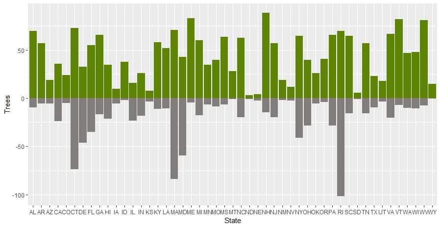
I’ve always loved the vertically oriented mirrored bar plots used so often by FiveThirtyEight. The problem is that these tall charts can’t fit on a wide-format presentation slide. And it is hard to read the horizontally oriented plot above. I realized that if I could wrap a mirrored bar chart into a circle, it can fit in any format. All that we need to do to make this into a circular plot is to add the coord_polar() element.
ggplot(TP, aes(x = State)) +
  geom_col(aes(y = Trees), fill = "#5d8402") +
  geom_col(aes(y = Pop.10), fill = "#817d79") +
  coord_polar()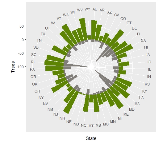
Now we have a mirrored, radial bar plot. But, this is super ugly and not very intuitive to read. This first useful adjustment we can make is to order the states to highlight the comparison we are interested in. In this case, we are trying to highlight the states that simultaneously have the greatest tree cover and highest population densities. One easy solution would be to rank order the states by either of those variables. For instance, we can order by tree cover rank.
ggplot(TP, aes(x = reorder(State, Trees))) +
  geom_col(aes(y = Trees), fill = "#5d8402") +
  geom_col(aes(y = Pop.10), fill = "#817d79") +
  coord_polar()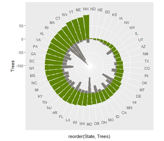
But that doesn’t really highlight the comparison because having lots of trees doesn’t really correlate with having lots of people.
ggplot(TP, aes(x = Pop, y = Trees)) +
  geom_point(size = 4, alpha = 0.7) +
  theme_minimal()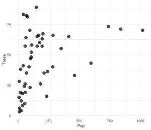
Instead, we can directly highlight the comparison by computing a new variable that simultaneously accounts for tree cover rank and population density rank. We cannot simply average rankings because that will produce a lot of ties. Also, if a state has a really low rank in one variable, it can discount the higher rank of the other variable. We can deal with this by using the mean of the squared rank orders of each variable (similar to mean squared error in regression). Also, note that since we want the largest values to be rank 1, we need to find the rank of the negative values.
TP <- TP %>% mutate(TreeRank = rank(-Trees), PopRank = rank(-Pop)) %>% mutate(SqRank = (TreeRank^2)+(PopRank^2)/2) %>% mutate(RankOrder = rank(SqRank))

ggplot(TP, aes(x = reorder(State, RankOrder))) +
  geom_col(aes(y = Trees), fill = "#5d8402") +
  geom_col(aes(y = Pop.10), fill = "#817d79") +
  coord_polar()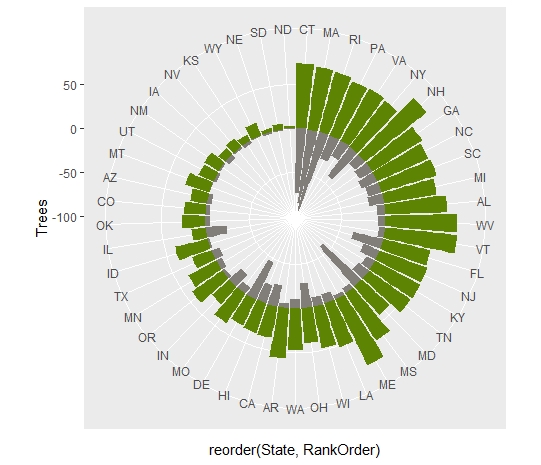
Next, we can improve the readability of the plot. Since our y-axis isn’t technically comparable, we can get rid of the axis label and ticks altogether using theme_void(), then we tell ggplot to label all of the states for us and to place the labels at position y = 100.
ggplot(TP, aes(x = reorder(State, RankOrder))) +
  geom_col(aes(y = Trees), fill = "#5d8402") +
  geom_col(aes(y = Pop.10), fill = "#817d79") +
  geom_text(aes(y = 100, label = State)) +
  coord_polar() +
  theme_void()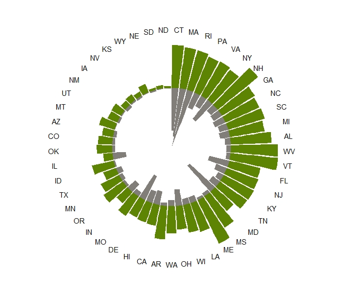
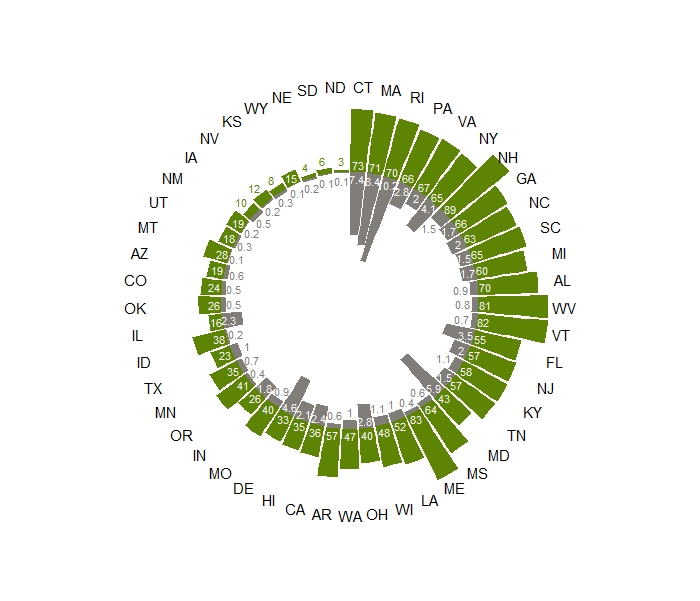
This plot is pretty worthless without some numbers to help us interpret what the bar heights represent. We can add those just as we added the state labels. In order to keep the character lengths short, we need to round the values. Also, now that the scale units are independent, I decided to further scale the population density values to 100 people per square mile simply by dividing the density by 100. The values tends to overlap, so we also need to make the font smaller.
ggplot(TP, aes(x = reorder(State, RankOrder))) +
  geom_col(aes(y = Trees), fill = "#5d8402") +
  geom_text(aes(y = 10, label = round(Trees, 2)), size = 3)+
  geom_col(aes(y = Pop.10), fill = "#817d79") +
  geom_text(aes(y = -10, label = round(Pop/100, 1)), size = 3)+
  geom_text(aes(y = 100, label = State)) +
  coord_polar() +
  theme_void()
This looks okay, but we can make it look even better. First we can adjust the limits of the y-axis. We can use the negative limit to create a white circle in the center, essentially pushing all of the data towards the outer ring instead of dipping down to the very central point.
Also, it bothers me that the bars cut into the value labels. We can adjust the position of the labels conditionally so that labels too big to fit in the bar are set outside of the bar using an ifelse() statement.
We can use the same type of ifelse() statement to conditionally color the labels so that those inside of the bars are white while those outside of the bars match the colors of the bars. We just need to include the scale_color_identiy() to let ggplot know that we are directly providing the name of the color.
ggplot(TP, aes(x = reorder(State, RankOrder))) +
  geom_col(aes(y = Trees), fill = "#5d8402") +
  geom_text(aes(y = ifelse(Trees >= 15, 8, (Trees + 10)), color = ifelse(Trees >= 15, 'white', '#5d8402'), label = round(Trees, 2)), size = 3)+
  geom_col(aes(y = Pop.10), fill = "#817d79") +
  geom_text(aes(y = ifelse(Pop.10 <= -15, -8, (Pop.10 - 10)), color = ifelse(Pop.10 <= -15, 'white', '#817d79'), label = round(Pop/100, 1)), size = 3)+
  geom_text(aes(y = 100, label = State)) +
  coord_polar() +
  scale_y_continuous(limits = c(-150, 130)) +
  scale_color_identity() +
  theme_void()
The way the state labels are so crowded on the right, but not on the left bugs me. We can set a standard distance, like y = 50, but then conditionally bump out the values if they would interfere with the bar.
And finally, ggplot builds in an obnoxious amount of white space around circular plots. We can manually reduce the white area by adjusting the plot margins.
ggplot(TP, aes(x = reorder(State, RankOrder))) +
  geom_col(aes(y = Trees), fill = "#5d8402") +
  geom_text(aes(y = ifelse(Trees >= 15, 8, (Trees + 10)), color = ifelse(Trees >= 15, 'white', '#5d8402'), label = round(Trees, 2)), size = 3)+
  geom_col(aes(y = Pop.10), fill = "#817d79") +
  geom_text(aes(y = ifelse(Pop.10 <= -15, -8, (Pop.10 - 10)), color = ifelse(Pop.10 <= -15, 'white', '#817d79'), label = round(Pop/100, 1)), size = 3)+
  geom_text(aes(y = ifelse(Trees <= 50 , 60, Trees + 15), label = State)) +
  coord_polar() +
  scale_y_continuous(limits = c(-150, 130)) +
  scale_color_identity() +
  theme_void() +
  theme(plot.margin=grid::unit(c(-20,-20,-20,-20), "mm"))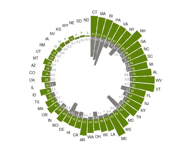
And there we have it. I made some final touches like changing the font and adding a legend in Illustrator.