In this post, I will show some methods of displaying mixed effect regression models and associated uncertainty using non-parametric bootstrapping. This is kind of a follow-up to my previous post on visualizing custom main effect models.
Introduction
Mixed models have quickly become the model du jour in many observation-oriented fields because these models obviate many of the issues of pseudoreplication inherent in blocked or repeated measures experiments and structured data.
They do this by treating the levels of categorical variables not as unique instances to be parameterized individually, but as random samples from an infinite distribution of levels. Instead of wasting degrees of freedom estimating parameter values for each level, we only need to estimate that global distribution (which requires only a handful of parameters) and instead focus our statistical power on the variables of interest.
Thanks to packages like nlme and lme4, mixed models are simple to implement. For all of their virtues, mixed models can also be a pain to visualize and interpret. Although linear mixed models are conceptually similar to the plain old ordinary least-squares regression we know and love, they harbor a lot more math under the hood, which can be intimidating.
One of the reasons mixed models are difficult to intuitively visualize is because they allow us to manage many levels of uncertainty. Depending on the focus of our analyses, we usually want to focus on certain aspects of the trends and associated uncertainty. For instance, an ecologist might be interested in the effect of nutrient input across many plots, but not interested in the difference between plots (i.e. traditional random effect). Or, an educator might be interested in the effect of different curricula, but not the difference between specific classes within specific schools (i.e. nested random effects). Or, a physician might be interested in the effect of a long-term treatment on a patient after accounting for baseline difference between patients (i.e. repeated measures).
In this tutorial, I’m going to focus on how to visualize the results of mixed effect models from lme4 using ggplot2. You can also clone the annotated code from my Github.
First, load in the necessary libraries.
library(tidyverse)
library(lme4)
library(ggsci)
library(see)
library(cowplot)
theme_set(theme_classic()) # This sets the default ggplot theme
To begin, I am going to simulate an experiment with 10 experimental units each containing 100 observations. These could be 10 plots with 100 random samples, or 10 schools with 100 student test scores, or the records of 10 patients from each of 100 follow-up visits. Each of the experimental units will ultimately get its own intercept and slope effect coefficient. The rand_eff data frame is essentially a Z matrix in classic mixed model notation. For this example, I’ll assume that the intercepts come from a distribution with standard deviation of 20 and the slopes from a distribution with standard deviation of 0.5. The random effects define the variation of the experimental unit around the main effect, so the mean of these distributions is necessarily 0.
set.seed(666)
rand_eff <- data.frame(unit = as.factor(seq(1:10)),
            b0 = rnorm(10, 0, 20),
            b1 = rnorm(10, 0, 0.5))
We can now join our random effect matrix to the full dataset and define our y values as yi = B0i + b0j + B1xi + b1xj + ε.
X <- expand.grid(unit = as.factor(seq(1:10)), obs = as.factor(seq(1:100))) %>%
  left_join(rand_eff,
            by = "unit") %>%
  mutate(x = runif(n = nrow(.), 0, 10),
         B0 = 20,
         B1 = 2,
         E = rnorm(n = nrow(.), 0, 10)) %>%
  mutate(y = B0 + b0 + x * (B1 + b1) + E)
Here’s a look at the data.
X %>%
  ggplot(aes(x = x, y = y, col = unit)) +
  geom_point() +
  facet_wrap(vars(unit))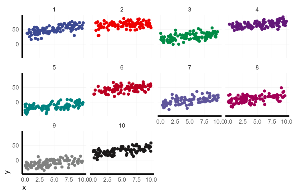
Random intercept model
For demonstration, let’s first assume that we are primarily interested in the overall slope of the relationship. For instance, if these are 10 field plots, we might want to know the effect of adding 1 unit of nutrient fertilizer, regardless of the baseline level of nutrients in a given plot.
We can do this by fitting a random intercept model and then looking at the summary of the resulting model.
lmer1 <- lmer(y ~ x + (1|unit), data = X)

summary(lmer1)
> summary(lmer1)
Linear mixed model fit by REML ['lmerMod']
Formula: y ~ x + (1 | unit)
Data: X
REML criterion at convergence: 7449.7
Scaled residuals:
Min 1Q Median 3Q Max
-2.88156 -0.68745 0.01641 0.71022 2.84532
Random effects:
Groups Name Variance Std.Dev.
unit (Intercept) 811.59 28.488
Residual 94.63 9.728
Number of obs: 1000, groups: unit, 10
Fixed effects:
Estimate Std. Error t value
(Intercept) 18.2652 9.0301 2.023
x 2.0091 0.1077 18.651
Correlation of Fixed Effects:
(Intr)
x -0.060
We can see that the fitted model does a good job estimating the fixed effect slope (B1), which we simulated with a coefficient of 2 as 2.0091. However, the model is underestimating the fixed effect intercept (B0) as 18.3 and overestimating the standard deviation of the random effect slopes (b1) as 28.5, when we simulated those values as 20 and 20.
If we think we could live with that fit, how would we go about visualizing our model?
Here is a look at our data with a linear regression fit to each experimental unit. It is clear that there is a wide spread in the intercepts, but the slopes are similar.
X %>%
ggplot(aes(x = x, y = y, col = unit)) +
geom_point() +
geom_smooth(method = 'lm', se = F)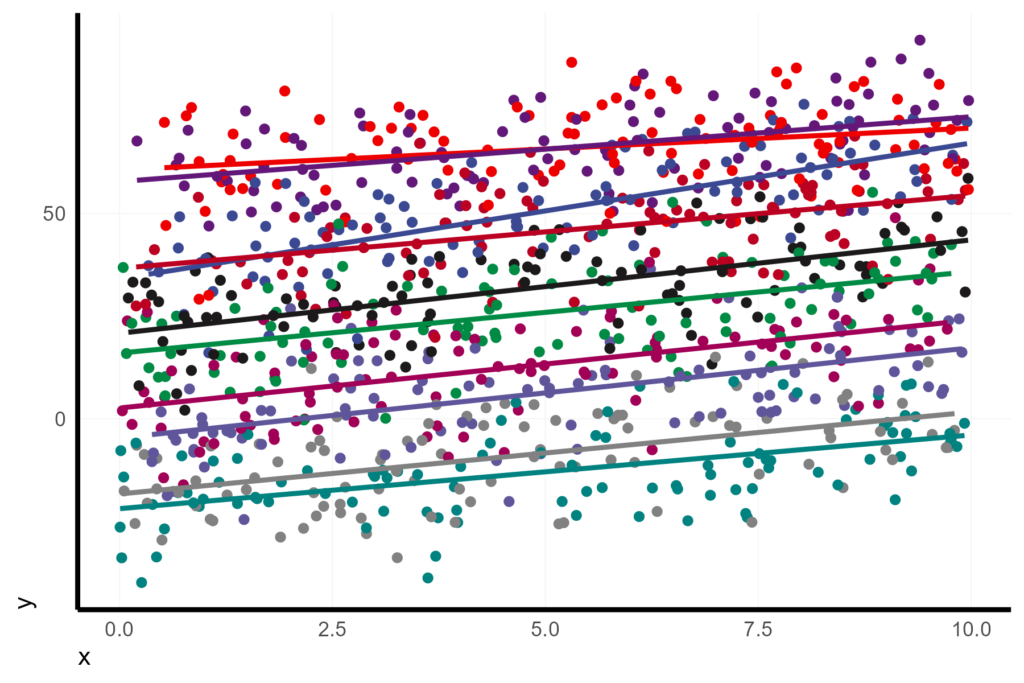
Marginal (Fixed effect) versus Conditional (Fixed + Random effect)
We might be tempted to use this built-in regression by group from ggplot as a visualization of the mixed model. However, this would be WRONG!!! GGplot is fitting an ordinary least squares regression without accounting for the random effect. That means that the estimates and the confidence intervals do not reflect our model. In this case, the estimates might be pretty close since our samples sizes across species are pretty even, but this could be wildly off, or even opposite, of mixed model slope estimate.
In a prior post, I showed how we can use the predict function to display our custom models in ggplot. In the case of mixed effect models, you can predict both the marginal and conditional values. The marginal value is the fixed effect. The conditional value is the mixed effect of the fixed and random effects.
In other words, the marginal effect is asking “What would I expect y to be for a given x without knowing which experimental unit it came from?” whereas the conditional effect is asking “What would I expect y to be for a given x from a given experimental unit?”
We can specify which prediction we want with the random effect formula argument re.form:
X <- X %>%
  mutate(fit.m = predict(lmer1, re.form = NA),
         fit.c = predict(lmer1, re.form = NULL))
The simplest visualization would be to display the marginal fit on the raw values.
X %>%
  ggplot(aes(x = x, y = y)) +
    geom_point(pch = 16, col = "grey") +
    geom_line(aes(y = fit.m), col = 1, size = 2) +
    coord_cartesian(ylim = c(-40, 100))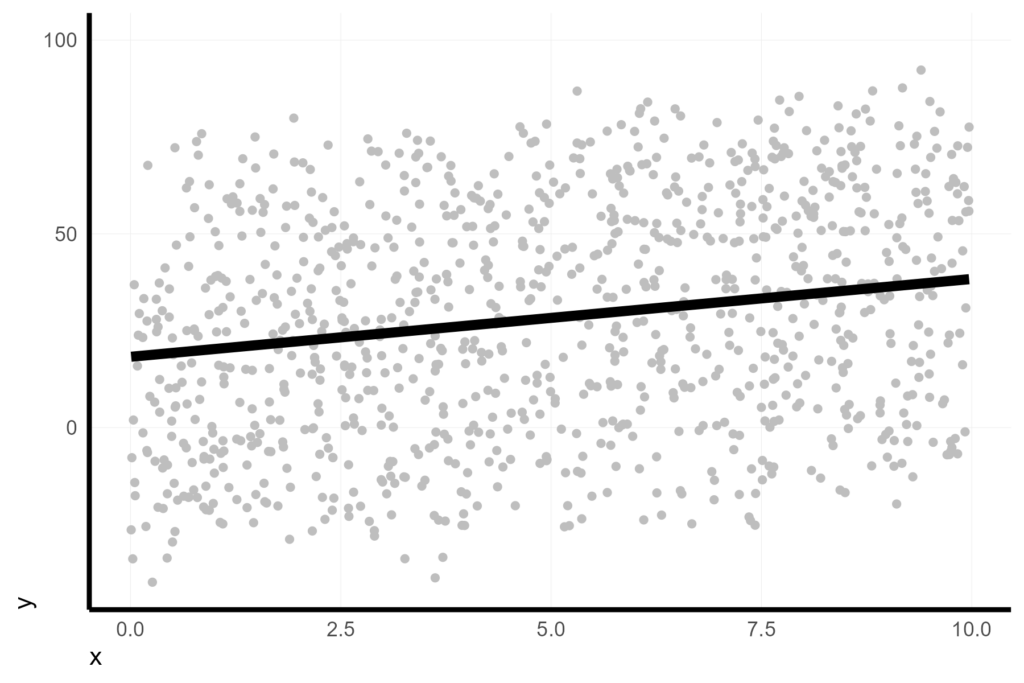
However, this is a bit misleading because it underrepresents our confidence in the slope by making it look like the residuals are huge.
But the residuals, and our confidence in the fit, is based on the conditional residual variance, which is much tighter. We can see that easily when we look at the conditional fits. This is one option for visualization, but it highlights the wrong element if our primary interest is the overall slope trend.
X %>%
  ggplot(aes(x = x, y = y, col = unit)) +
  geom_point(pch = 16) +
  geom_line(aes(y = fit.c, col = unit), size = 2) +
  facet_wrap(vars(unit)) +
  coord_cartesian(ylim = c(-40, 100))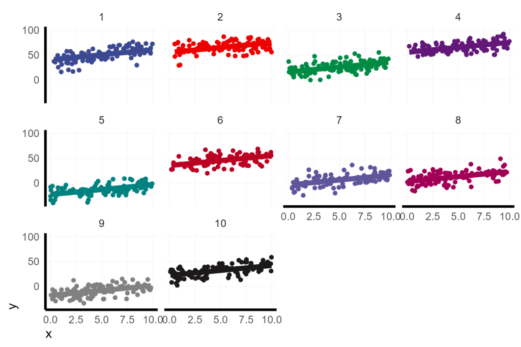
Displaying the conditional fits on the same facet helps. Now we can see the variation in the conditional intercepts, but as a tradeoff it makes it difficult to get a sense of the residual variance because there are too many points.
X %>%
  ggplot(aes(x = x, y = y, col = unit)) +
  geom_point(pch = 16) +
  geom_line(aes(y = fit.c, col = unit), size = 2)  +
  coord_cartesian(ylim = c(-40, 100))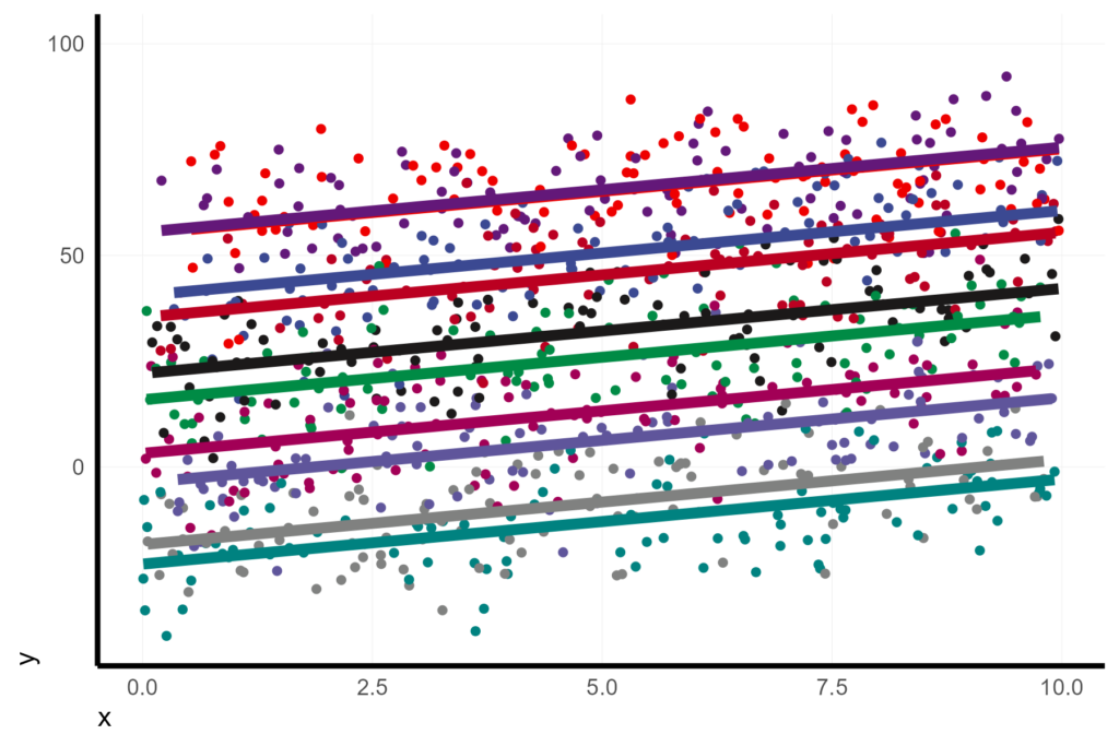
Instead, I think it makes more sense to display the conditional residuals around the marginal effect. You can kind of think of this as collapsing all of the conditional fits from the previous plot into the single marginal fit. We can do this by extracting the residuals (which are the conditional residuals) and then displaying the points as the marginal fit plus the residuals.
X <- X %>%
  mutate(resid = resid(lmer1))

X %>%
  ggplot(aes(x = x, y = fit.m + resid, col = unit)) +
  geom_point(pch = 16) +
  geom_line(aes(y = fit.m), col = 1, size = 2)  +
  coord_cartesian(ylim = c(-40, 100))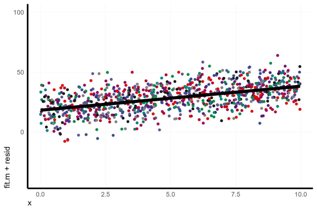
In some cases, we might also want to give the reader a sense of the variation in the conditional intercepts. For instance, the fact that the slope is so consistent across a wide range of baselines might actually increase our confidence in the relationship even further.
There are a couple of ways to simultaneously display both our confidence in the fit of the marginal trend and the variance in the conditional fits.
Depending on the number of conditional units, one option is to display the conditional fits below the scatter plot of the conditional residuals.
X %>%
  ggplot(aes(x = x, y = fit.m + resid)) +
  geom_line(aes(y = fit.c, col = unit), size = 1) +
  geom_point(pch = 16, col = "grey") +
  geom_line(aes(y = fit.m), col = 1, size = 2) +
  coord_cartesian(ylim = c(-40, 100))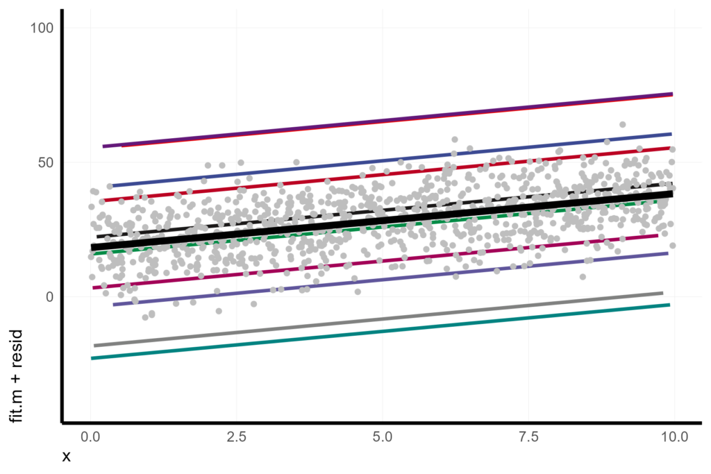
Another option is to display a density plot or histogram of the estimated conditional intercepts (also known as the Best Linear Unbiased Predictors or BLUPs). In a random effect framework, we are assuming that the conditional intercepts are samples of some infinite distribution of intercepts, so this histogram from the BLUPs of our model is essentially an empirical representation of that idealized distribution. (Alternatively, we could also simply plot the idealized distribution as a normal distribution from the estimated variance of the random effect, but I like the empirical density plot because it also give a sense of when our conditionals do NOT conform to the assumption of being samples from a normal distribution).
We can extract the BLUPs from the model object (b0_hat) and add those to the model estimate of the marginal intercept (B0_hat) to get the estimated conditional intercepts. This is our data frame of conditional estimates.
Cond_DF <- as.data.frame(ranef(lmer1)) %>% transmute(unit = grp, b0_hat = condval) %>% mutate(Intercept_cond = b0_hat + summary(lmer1)$coef[1,1])

X %>%
  ggplot(aes(x = x, y = fit.m + resid)) +
  geom_point(pch = 16, col = "grey") +
  geom_violinhalf(data = Cond_DF, aes(x = 0, y = Intercept_cond), trim = FALSE, width = 3, fill = NA) +
  geom_line(aes(y = fit.m), col = 1, size = 2) +
  coord_cartesian(ylim = c(-40, 100))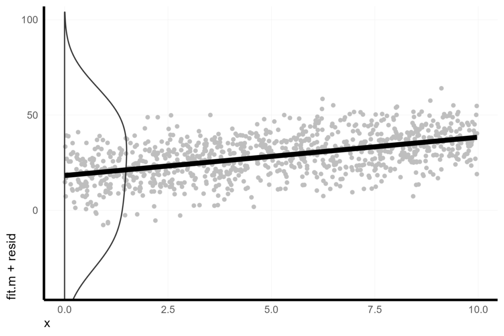
Random slope and intercept model
Now let’s imagine that we are not satisfied with the random intercept model and also want to fit a random slope parameter. In this case, we want to estimate the distribution of slopes for all experimental units across the values of x.
lmer2 <- lmer(y ~ x + (x|unit), data = X)We can see that the values from the model are getting much closer to the known values that we simulated.
summary(lmer2)
> summary(lmer2)
Linear mixed model fit by REML ['lmerMod']
Formula: y ~ x + (x | unit)
   Data: X

REML criterion at convergence: 7442.8

Scaled residuals:
    Min      1Q  Median      3Q     Max
-3.2071 -0.6957  0.0268  0.7067  2.8482

Random effects:
 Groups   Name        Variance Std.Dev. Corr
 unit     (Intercept) 846.3021 29.0913
          x             0.2151  0.4638  -0.27
 Residual              93.0853  9.6481
Number of obs: 1000, groups:  unit, 10

Fixed effects:
            Estimate Std. Error t value
(Intercept)  18.3474     9.2202    1.99
x             2.0075     0.1816   11.05

Correlation of Fixed Effects:
  (Intr)
x -0.250
Correlation of random effects
One important addition from the random intercept-only model is the estimate for the correlation between the distribution of the random slopes and random intercepts (which the model estimates as -0.268, see output below). Because we simulated these data, we know that there is no true correlation between the unit slopes and intercepts. But, because we have a small number of units, we just happened to have an emergent correlation.
summary(lmer2)$varcor

cor.test(rand_eff$b0, rand_eff$b1)
> summary(lmer2)$varcor
Groups Name Std.Dev. Corr
unit (Intercept) 29.09127
x 0.46378 -0.268
Residual 9.64807
>
> cor.test(rand_eff$b0, rand_eff$b1)
Pearson's product-moment correlation
data: rand_eff$b0 and rand_eff$b1
t = -1.2158, df = 8, p-value = 0.2587
alternative hypothesis: true correlation is not equal to 0
95 percent confidence interval:
-0.8205150 0.3123993
sample estimates:
cor
-0.3949022
If you had a reason to assume NO correlation between your random effects, you could specify that as (x||unit) in this way:
lmer3 <- lmer(y ~ x + (x||unit), data = X)

summary(lmer3)

summary(lmer3)$varcor
> summary(lmer3)
Linear mixed model fit by REML ['lmerMod']
Formula: y ~ x + ((1 | unit) + (0 + x | unit))
Data: X
REML criterion at convergence: 7443.3
Scaled residuals:
Min 1Q Median 3Q Max
-3.1812 -0.6951 0.0223 0.7074 2.8523
Random effects:
Groups Name Variance Std.Dev.
unit (Intercept) 833.2681 28.8664
unit.1 x 0.2092 0.4574
Residual 93.1011 9.6489
Number of obs: 1000, groups: unit, 10
Fixed effects:
Estimate Std. Error t value
(Intercept) 18.325 9.149 2.003
x 2.010 0.180 11.165
Correlation of Fixed Effects:
(Intr)
x -0.035
>
> summary(lmer3)$varcor
Groups Name Std.Dev.
unit (Intercept) 28.86638
unit.1 x 0.45738
Residual 9.64889
As with the random intercept model, we can use the predict function to get expected values of y based on the marginal or conditional estimates. Note that re.form = NULL is the same as re.form = ~ (x|unit).
X <- X %>%
  mutate(fit2.m = predict(lmer2, re.form = NA),
         fit2.c = predict(lmer2, re.form = NULL),
         resid2 = resid(lmer2))
As with the random intercept model, one way to visualize the model is to show the conditional intercept/slopes as fitted lines and the conditional residuals as points.
pmain_lmer2 <- X %>%
  ggplot(aes(x = x, y = fit2.m + resid2)) +
  geom_line(aes(y = fit2.c, col = unit), size = 1) +
  geom_point(pch = 16, col = "grey") +
  geom_line(aes(y = fit2.m), col = 1, size = 2) +
  coord_cartesian(ylim = c(-40, 100))
pmain_lmer2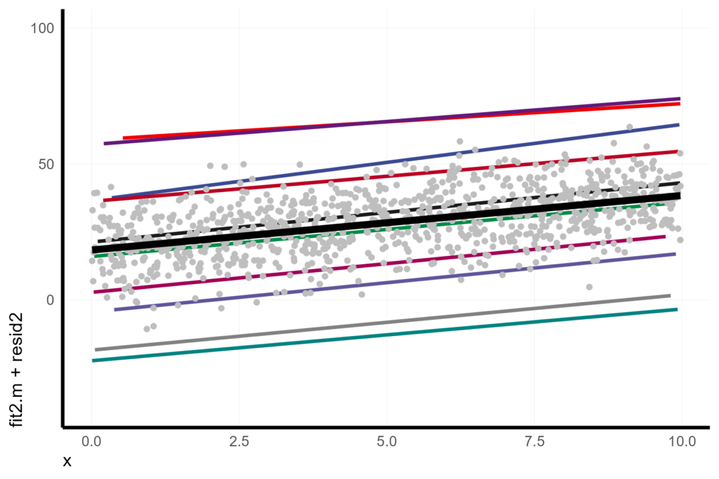
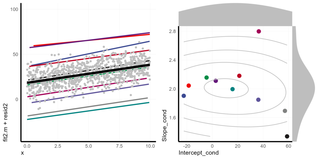
Visualizing the random effect variance gets a bit more difficult with two random parameters. One strategy I like is to include an additional plot of the correlation and distribution of the random effects.
Basically, we make a scatter plot of the BLUPs of slopes and intercepts, Then we make histograms for each and add those to the margins of the plot. (I’m relying heavily on Claus Wilke’s post to code the histograms at the margins of the plot). Finally, we patch it all together with cowplot.
Cond_DF2 <- as.data.frame(ranef(lmer2)) %>%
  transmute(unit = grp,
            term = case_when(term == "(Intercept)" ~ "b0_hat",
                             term == "x" ~ "b1_hat"),
            value = condval) %>%
  pivot_wider(id_cols = "unit", names_from = "term", values_from = "value") %>%
  mutate(Intercept_cond = b0_hat + summary(lmer2)$coef[1,1],
         Slope_cond = b1_hat + summary(lmer2)$coef[2,1])

pmain <- Cond_DF2 %>%
  ggplot(aes(x = Intercept_cond, y = Slope_cond)) +
    geom_point(aes(col = unit), size = 3) +
    geom_density2d(bins = 4, col = "grey", adjust = 3)

xdens <- axis_canvas(pmain, axis = "x") +
  geom_density(data = Cond_DF2, aes(x = Intercept_cond), fill = "grey", col = NA, trim = FALSE, adjust = 2)

ydens <- axis_canvas(pmain, axis = "y", coord_flip = TRUE) +
  geom_density(data = Cond_DF2, aes(x = Slope_cond), fill = "grey", col = NA, trim = FALSE, adjust = 2) +
  coord_flip()

p1 <- insert_xaxis_grob(pmain, xdens, grid::unit(.2, "null"), position = "top")
p2 <- insert_yaxis_grob(p1, ydens, grid::unit(.2, "null"), position = "right")

pinsert_lmer2 <- ggdraw(p2)

plot_grid(
  pmain_lmer2,
  pinsert_lmer2,
  nrow = 1
)
Bootstrapping uncertainty
For many researchers, one of the most frustrating aspects of mixed models is that estimating confidence intervals and testing the significance of parameters is not straight forward. I highly encourage that folks take a look at Ben Bolker’s thorough considerations on the topic. Dr. Bolker suggests many different problems and solutions depending on the structure of your model.
I think that the most generalized solution is to use non-parametric bootstrapping. This method essentially asks the question, “How would our model fit change if we could go back in time, select different samples, and then rerun our analysis?”
We can’t go back in time, but maybe we CAN assume that our original samples were representative of the population. If so, instead of resampling the actual population, we could resample our original observations WITH REPLACEMENT to approximate resamples of the population. If we do this many time, we can then make intuitive statements like, “95% of the time, if we reran this experiment, we’d expect the main effect to be between X and X value.”
It is important to stop an consider what re-doing your data generation process would look like. For instance, imagine our mock data had come from 1000 independent random observation that we then categorized into “units” to control for autocorrelation after the fact. If we re-ran the process to generate a new dataset, we may not always get the same number of observations in each “unit”.
However, if our mock data came from an experiment where we planted 100 trees in each of 10 “units”, then when we re-ran the experiment, we could control the number of individuals per unit. We would also need to consider if we would always choose to plant in the same 10 units, or if we would also choose units at random.
The structure of the data generation process can guide our bootstrap resampling strategy. In the first example, we could simply bootstrap all individual observations (although we may need to worry about non-convergence and small sample sizes). In the second example, where unit choice is constrained, we might decide to bootstrap within units. If, in the second example, we could also randomize units, we should probably take a hierarchical approach, first bootstrapping the units and then bootstrapping the observations within each unit.
NOTE: The problem with non-parametric boostrapping of this kind is that it can be computationally expensive. One trick is to parallelize the bootstraps across all of your computer’s processors. By default, R uses one processor, so it will fit one bootstrap iteration at a time, sequentially. But the bootstraps are independent and the order doesn’t matter. If you computer has 8 cores, there is no reason not to fit 8 models simultaneously on 8 processors in 1/8 of the time. Unfortunately, setting up for parallel processing can be an adventure of its own. I won’t detail it here, but will try to dedicate a post on it in the future. If you have a very large dataset and can’t run bootstraps in parallel, you might consider some of the other methods suggested by Dr. Bolker.
Since our dataset is fairly small and simple, I’ll demonstrate how we can use bootstrapping to simultaneously estimate confidence intervals of our model parameters and visualize error bands.
Just keep in mind that if you are fitting models with complex random effect designs, you’ll have to think critically about which elements and levels of variance are most important for your data story. Hopefully, these examples will at least get you started and inspired!
The bootstrapping process begins by initiating an empty dataframes to accept the parameter estimates for the fixed effect coefficients and random effect variances. The number of rows in the dataframe will be the same as the number of bootstrap iterations, so we set that first. The number of iterations is the number of times we want to simulate re-doing our data generation. The convention is 1000, but the more the merrier!
Number_of_boots <- 1000The number of columns for the dataframes will equal the number of fixed effect coefficients and random effect variances. We can extract these from the initial model. First we extract the coefficients, then transpose the table into wide format.
# Extract the fixed effect coefficients.
FE_df <- fixef(lmer2) %>%
  t() %>%
  as.data.frame()

# Extract the random effects variance and residual variance
RE_df <- VarCorr(lmer2) %>%
  as.data.frame() %>%
  unite("Level", -c(vcov, sdcor)) %>%
  select(-vcov) %>%
  t() %>%
  as.data.frame()
Next, we create empty dataframes to take our bootstraps.
BS_params <- data.frame(matrix(nrow = Number_of_boots, ncol = ncol(FE_df)))
colnames(BS_params) <- colnames(FE_df)

BS_var <- data.frame(matrix(nrow = Number_of_boots, ncol = ncol(RE_df)))
colnames(BS_var) <- RE_df["Level",]
In addition, we will be predicting marginal values from each model. So, we need to create a prediction dataframe with an empty column to store the predicted values. For this example, we only need to predict ŷ values for a handful of x values that represent the range of xs. I chose to use 10-quantiles because I want to be able to fit a non-linear confidence band later. If this was a non-linear fit, we might want even more prediction values.
BS_pred <- expand.grid(x = quantile(X$x, probs = seq(0, 1, length.out = 10)),
                       iterration = 1:Number_of_boots,
                       pred = NA)
Finally, we can write a loop that creates a resampled dataset (with replacement) and fits the original model formula to the new dataset. From the new model, we can then extract the fixed and random effects and predict ŷs for the subset of x values. All of these get stored in their respective dataframes, indexed by the iteration number.
for(i in 1:Number_of_boots){
BS_X <- slice_sample(X, prop = 1, replace = TRUE)
BS_lmer <- lmer(formula = lmer2@call$formula,
data = BS_X)

BS_params[i,] <- BS_lmer %>%
fixef() %>%
t() %>%
as.data.frame()

BS_var[i,] <- BS_lmer %>%
VarCorr() %>%
as.data.frame() %>%
.$sdcor

BS_pred[which(BS_pred$iterration == i),]$pred <- predict(BS_lmer,
newdata = BS_pred[which(BS_pred$iterration == i),],
re.form = ~0)
}
Now we have a dataframe of the marginal (i.e. fixed effect) intercept and slope parameter estimates from 1000 models fit to bootstraps of our original data.
head(BS_params)
> head(BS_params)
  (Intercept)        x
1    18.06942 2.096240
2    18.18005 2.070043
3    18.13506 2.093110
4    18.77862 1.928048
5    18.47963 2.013831
6    18.28875 2.005947
One way to get a sense of our confidence in these parameter estimates is to take a look at their distributions.
BS_hist_x <- BS_params %>%
  ggplot(aes(x = x)) +
  geom_histogram()

BS_hist_intercept <- BS_params %>%
  ggplot(aes(x = `(Intercept)`)) +
  geom_histogram()

BS_hists <- plot_grid(
  BS_hist_intercept,
  BS_hist_x,
  nrow = 1)

BS_hists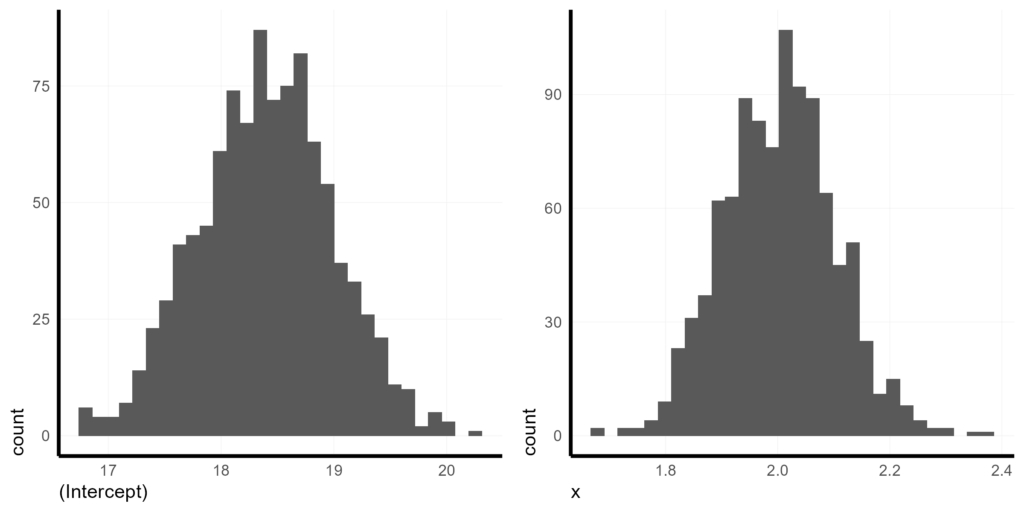
These histograms tell us so much more than a typical confidence interval because we can see the full distribution. We can see that the baseline effect on y given x = 0 is around 18.5 and we are very confident it is between 17 and 20. We can also see that the effect of 1 unit change in x is expected to yield about a 2.0 unit change in y and we are extremely confident that the slope is positive and greater than 1.7 but probably less than 2.3.
Although we won’t directly visualize the random effect variance, we can see the estimates in the BS_var dataframe.
BS_var %>% head()
> BS_var %>% head()
  unit_(Intercept)_NA unit_x_NA unit_(Intercept)_x Residual_NA_NA
1            28.30440 0.4427450         0.01009018       9.786112
2            30.31353 0.6265168        -0.42315981       9.365630
3            30.33369 0.5261389        -0.78128072       9.320844
4            28.51896 0.6079722        -0.08575830       9.739881
5            30.50690 0.5835157        -0.64068868       9.718633
6            29.17012 0.5182395        -0.28244154       9.930305
Here, the first column is the estimated variance attributed to the random intercepts, the second column is the variance estimate of the random slopes, and the third column is the correlation between the random effects. The fourth and final column is the residual variation after accounting for the random effects (i.e. the conditional residual variation). This is information you’d want to include in a table of the model output.
We also have a dataframe of 10 predicted ŷs for each iteration.
head(BS_pred, n = 20)> head(BS_pred, n = 20)
x iterration pred
1 0.008197445 1 18.08660
2 1.098954093 1 20.37309
3 2.231045775 1 22.74622
4 3.266109165 1 24.91596
5 4.323574828 1 27.13267
6 5.667717615 1 29.95031
7 6.672807375 1 32.05722
8 7.748743587 1 34.31264
9 8.793447507 1 36.50259
10 9.968969584 1 38.96677
11 0.008197445 2 18.19702
12 1.098954093 2 20.45493
13 2.231045775 2 22.79841
14 3.266109165 2 24.94104
15 4.323574828 2 27.13003
16 5.667717615 2 29.91247
17 6.672807375 2 31.99305
18 7.748743587 2 34.22028
19 8.793447507 2 36.38286
20 9.968969584 2 38.81624
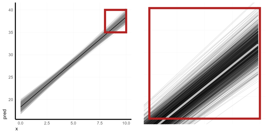
Rather than using a traditional confidence band (which basically reduces the distribution of our bootstraps down to two points: high and low), I prefer to actually show all of the iterations and let the density of the lines make a kind of optical illusion of a confidence band.
Since our estimates are pretty tightly distributed, I’m using cowplot to show what this looks like while also zooming in to a section.
plot_grid(
  BS_pred %>%
    ggplot(aes(x = x, y = pred)) +
    geom_line(aes(group = iterration), alpha = 0.1, col = "grey50") +
    geom_line(data = X,
              aes(x = x, y = fit2.m)) +
    geom_rect(aes(ymin = 35, ymax = 40,
                  xmin = 8, xmax = 10),
              col = "firebrick",
              fill = NA,
              size = 2),
  BS_pred %>%
    ggplot(aes(x = x, y = pred)) +
    geom_line(aes(group = iterration), alpha = 0.1, col = "black") +
    geom_line(data = X,
              aes(x = x, y = fit2.m),
              col = "grey",
              size = 2) +
    coord_cartesian(xlim = c(8, 10),
                    ylim = c(35, 40)) +
    geom_rect(aes(ymin = 35, ymax = 40,
                  xmin = 8, xmax = 10),
              col = "firebrick",
              fill = NA,
              size = 2) +
    theme(axis.line = element_blank(),
          axis.text = element_blank(),
          axis.title = element_blank()) +
    labs(x = "", y = ""),
  nrow = 1
)
Of course, we can also create a more traditional 90% confidence band by summarizing the 5th and 95th percentiles of ŷ across each x value.
BS_pred %>%
  group_by(x) %>%
  summarise(hi = quantile(pred, 0.95),
            lo = quantile(pred, 0.05)) %>%
  ggplot(aes(x = x)) +
    geom_ribbon(aes(ymin = lo, ymax = hi),
                fill = "grey50",
                alpha = 0.3) +
    geom_line(data = X,
              aes(x = x, y = fit2.m))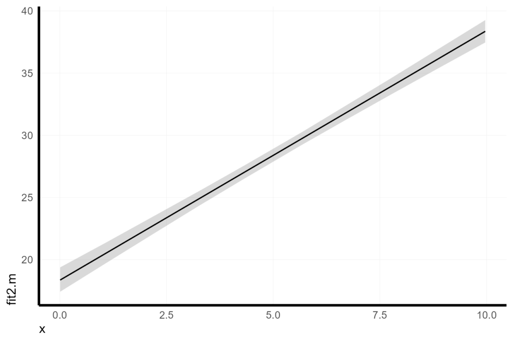
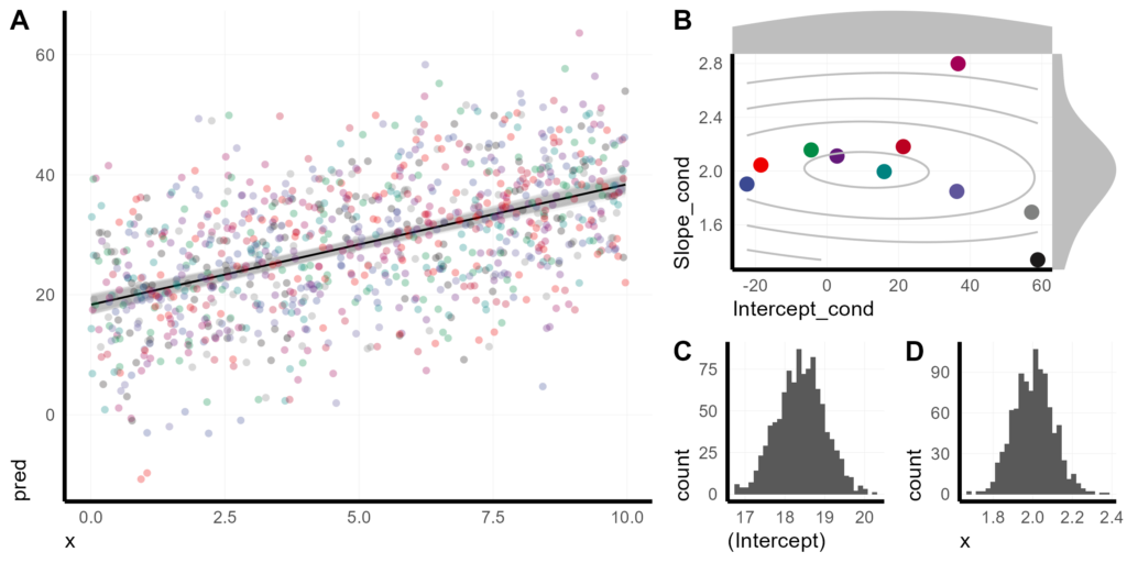
Putting it all together
Putting it all together, here is my preferred visualization of a mixed effect model with random intercepts and slopes, using bootstrapping to display uncertainty.
BS_ci_lines <- BS_pred %>%
  ggplot(aes(x = x, y = pred)) +
    geom_line(aes(group = iterration), alpha = 0.1, col = "grey") +
    geom_line(data = X,
              aes(x = x, y = fit2.m)) +
    geom_point(data = X,
               aes(x = x, y = fit2.m + resid2, col = unit),
               alpha = 0.3,
               pch = 16)

plot_grid(
  BS_ci_lines,
  plot_grid(
    pinsert_lmer2,
    plot_grid(
      BS_hist_intercept,
      BS_hist_x,
      nrow = 1,
      labels = c("C", "D")),
    nrow = 2,
    rel_heights = c(1, 0.7),
    labels = c("B", NA)
  ),
  nrow = 1,
  rel_widths = c(1, 0.7),
  labels = c("A", NA)
)plot_grid(
  BS_ci_lines,
  plot_grid(
    pinsert_lmer2,
    plot_grid(
      BS_hist_intercept,
      BS_hist_x,
      nrow = 1,
      labels = c("C", "D")),
    nrow = 2,
    rel_heights = c(1, 0.7),
    labels = c("B", NA)
  ),
  nrow = 1,
  rel_widths = c(1, 0.7),
  labels = c("A", NA)
)
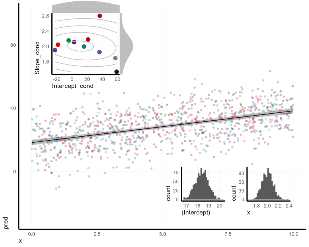
Or, if we want to get really fancy with it, we could inset everything into one plot panel.
BS_ci_lines +
  coord_cartesian(ylim = c(-30, 100)) +
  annotation_custom(ggplotGrob(BS_hists),
                    xmin = 5,
                    xmax = 10,
                    ymin = -30,
                    ymax = 5
  ) +
  annotation_custom(ggplotGrob(pinsert_lmer2),
                    xmin = 0,
                    xmax = 4,
                    ymin = 50,
                    ymax = 110
  )