One of the funny conventions in ecology is the practice of naming a new statistical unit after a preeminent ecologist. For instance, in 1949 J.B.S. Haldane proposed a new unit for measuring evolutionary change.1 Imagine we wanted to compare rates of evolution in mussels from Asia and North America. Haldane proposed that we could measure a trait like shell length in both ancient and modern mussel in each location and divide the difference of mean trait values by the time between the samples. He names the unit the darwin after Charles Darwin.
The darwin is a great unit if you are interested in long-term macroevolutionary change, but sometimes it falls short for certain questions. For instance, what if we wanted to compare the evolutionary rates of a tree and its insect pest? One limitation of the darwin that Haldane noted was that it doesn’t account for generation times. Over the order of millions of years, it probably is a wash, but if you are interested in short time windows, say 1000 years, generation times matter, especially when comparing a tree with 100 year generation time and an insect that reproduces annually. For this purpose, Philip Gingerich proposed a unit he dubbed the haldane.2 The haldane is similar to the darwin, but the rather than directly comparing mean trait values it compares trait values scaled to their standard deviation and rather than measuring time in millions of years, it measures time in generations. Here’s how it looks:
The haldane is good unit for change over time, but what if we are also interested in divergence over space? For instance, what if we are interested in comparing rates of evolutionary change in populations of fish in a river channel? We would expect there to be more divergence in population at the headwaters and the outlet than between populations just a few stream-miles apart, so how can we account for that? Richardson et al. proposed a unit for just this question in 2014.3 They suggested that there is a radius in which we would expect gene flow to disallow divergence. This is the dispersal kernel, depicted in their paper. Within that radius we would be surprised if trait values differed between populations, but outside we might be less surprised. Therefore, they scaled their unit to a distance ratio with that radius. To keep with tradition, they named their unit the wright after Sewall Wright, one of the fathers of population genetics. In their formulation, the difference in trait means is compared as in the darwin, but it is scaled to the pooled standard deviation and the distance ratio.
And this leads me to my current adventure in evolutionary analysis: how to best visualize the pairwise divergence of multiple populations with overlapping dispersal kernels? In my case, I have phenotypic traits for 15 population. I would like to visualize the pair-wise difference in traits with respect to their geographic distance. To further complicate things, I’m not entirely sure what distance to assign for a standard dispersal kernel.
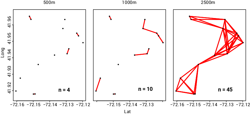
My strongest idea so far has been to display a pair-wise matrix with wright values in the lower triangle and geographic distance in the upper triangle. I ran an ANOVA on trait means by location and used the multiple Tukey HSD post hoc comparison p-values to assign a shading to significant divergence in the lower triangle. In the upper triangle, red shaded values indicate distances less than a 1000m dispersal kernels. The outlined squares in the lower triangle indicate significant divergence within a dispersal kernel, or microgeographic divergence as defined by Richardson et al. 2014. Since I’m not sure what an average dispersal distance might be, I ran the same analysis for 500m, 1000m, and 2500m (only the 1000m analysis is shown). To help illustrate the matrix, I’ve include a nearest neighbor joining spatial plot for each dispersal kernel distance (500m, 1000m, and 2500m).
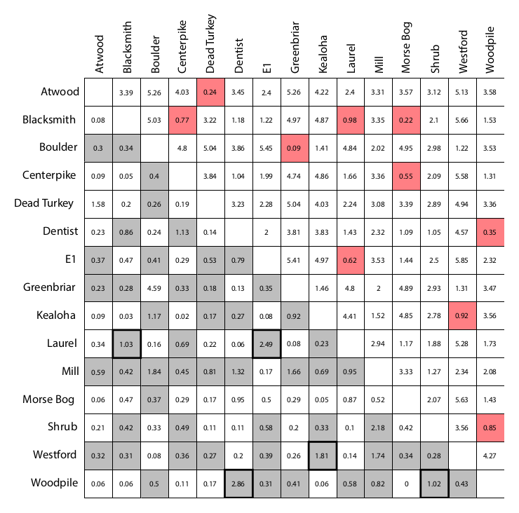
There is a lot of information digested into this one plot. So I’d be happy to hear any thought on how I could improve it.
1 Haldane, J.B.S. (1949). Suggestions as to quantitative measurement of rates of evolution. Evolution 3:51–56.
2 Gingerich, P.D. (1993). Quantification and comparison of evolutionary rates. American Journal of Science. 293-A, 453-478.
3 Richardson, J.L. et al. (2014). Microgeographic adaptation and the spatial scale of evolution. Trends in Ecology and Evolution. 29(3), 165-176.