Recently, I gave a presentation to a class of Yale Masters students about how to give better scientific presentations. This is a topic I think about a lot, coming from a background in non-profit communications.
I’ve replicated all of the slides and script below, but first, here are the bullets if you’re short on time.
To make better presentations, try:
- Reorient your presentation to optimize for short attention spans. This means stating your conclusion first, then presenting your data, then connecting it to the broader topic.
- Minimize distractions. Avoid designs and presentation strategies that will distract from your main topic.
- Bad storytelling can be a distraction from even the best story, so please, practice your #$*&ing presentation!
- Use figures to tell stories, not to show data. Reduce data stories to minimum story units and only tell one story unit at a time using layers, starting with the axes.
- I also include a number of simple PowerPoint hacks that will help you avoid common errors that lead to wonky slides.
Here’s my full presentation:
What is the point of academic presentations? The obvious answer is “to transmit information about our science.” Realistically, most of us are also motivated by little more than adding a new line to our CV. An underappreciated purpose of presentations is as a vehicle for networking. Presentations are like calling cards and signal to your audience if your work is interesting. It also give audience members a brief window into you as a scientist.
We need to give good presentations because, first, the whole damn point is to transmit our information. Bad presentation are a barrier to that transmission. Second, we need to give good presentations because presentations are like our tinder profiles to collaborators. A bad presentation indicates that you do not care enough about your work or your peers in the audience to bother making a tolerable presentation.
Some might question the wisdom of signing up to give a presentation about not giving bad presentations. But you should be able to guess from the title of my talk that I think the bar is exceptionally low. More often than not, academics give pretty terrible presentations. But there are a few simple things you can do to give really great presentations.
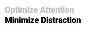
It basically boils down to just two key elements:
Optimize for attention
Minimize distractions
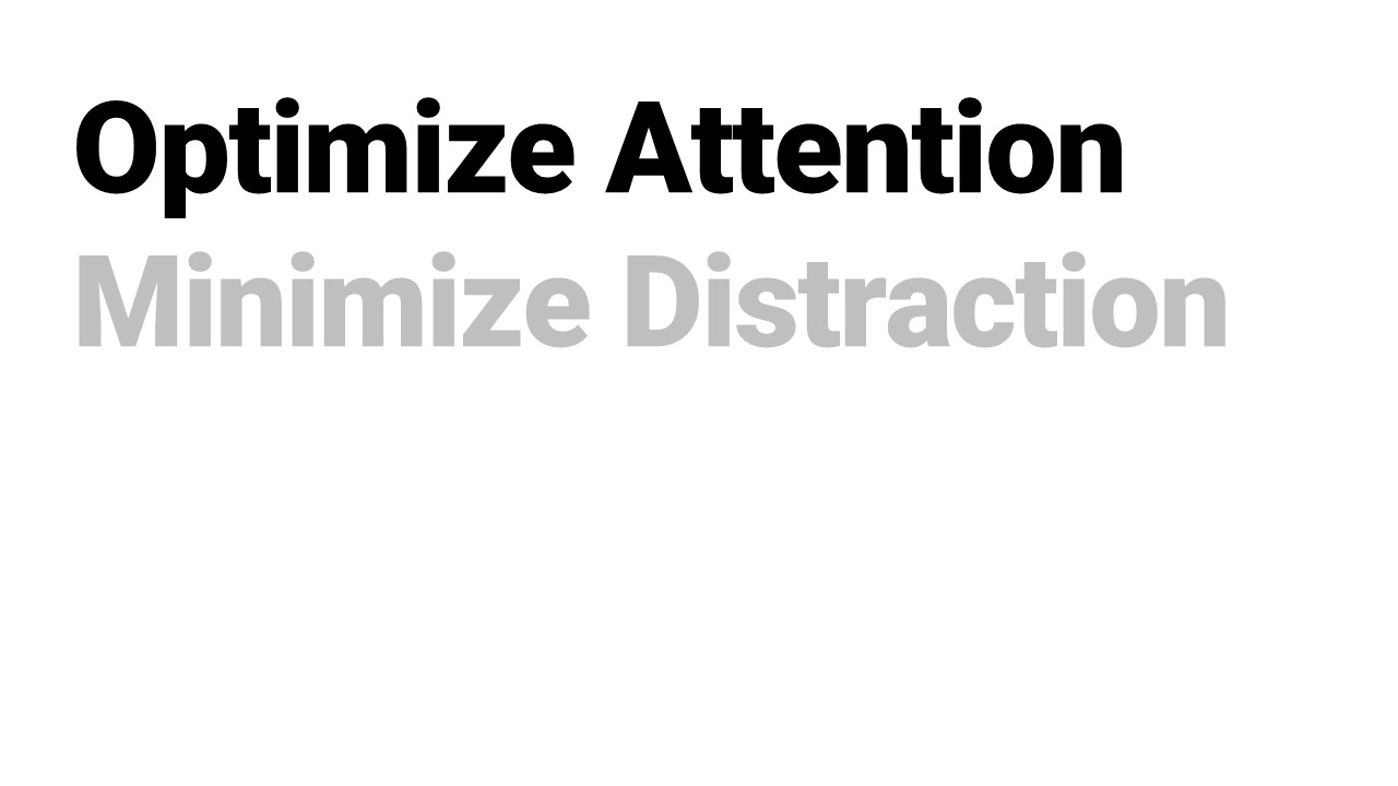
Let me show you what I mean by Optimizing for Attention.
Almost every science presentation I have ever seen is organized the same way that we organize papers.
We start with some big picture background questions, then we talk about our specific question, then we explain our system, then we detail our methods, then we talk through our results, and if we have enough time at the end, we finally get to our conclusion, which is the main punchline of the talk. That is the chocolate at the center of the tootsie-pop.
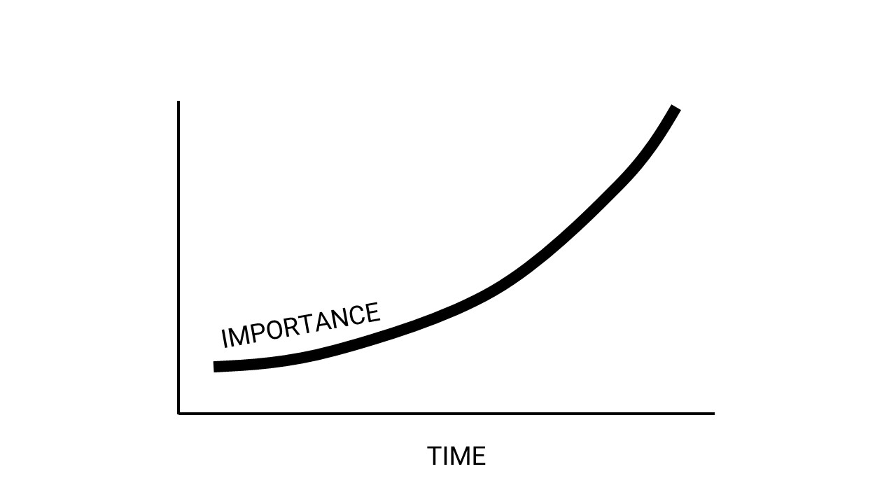
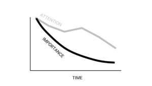
The problem with this model is that our attention span diminishes over time. So, we end up wasting all of the optimal attention window laying out the least important information, and we wait until half the audience has zoned out before delivering the punchline.
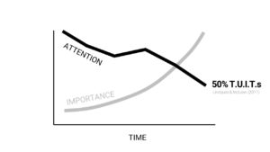
Lindquist & McLean (2011) showed how attention diminishes over time by surveying folks during 45-minute lectures. They sounded a signal at intervals during presentations and then had respondents indicate if they were thinking about something unrelated to the lecture, called Thoughts or Images Unrelated to Tasks (= TUITs (basically, day dreaming)). The frequency of daydreaming increased over time until only about half of the audience was focused at any given time towards the end of the presentation.
To optimize for attention spans, one option is to flip your presentation to match the audience’s daydreaming frequency. Give the punchline first. Rather than starting by explaining why your question matters, start with your conclusion and then explain how it is relevant.
Even though this might seems strange, it is actually how we read papers. Rarely do we ever read papers linearly. Most people skip to the last line of the abstract to get the punchline, then maybe read the abstract or figure captions, then the conclusions. Maybe you read the methods or the text of the results section next, but the last thing you read is the background or introduction.
Even if you arrange your presentation to optimize for folks attention span early, we still don’t want to lose most of our audience along the way. We’d like to keep folks’s attention as much as possible.
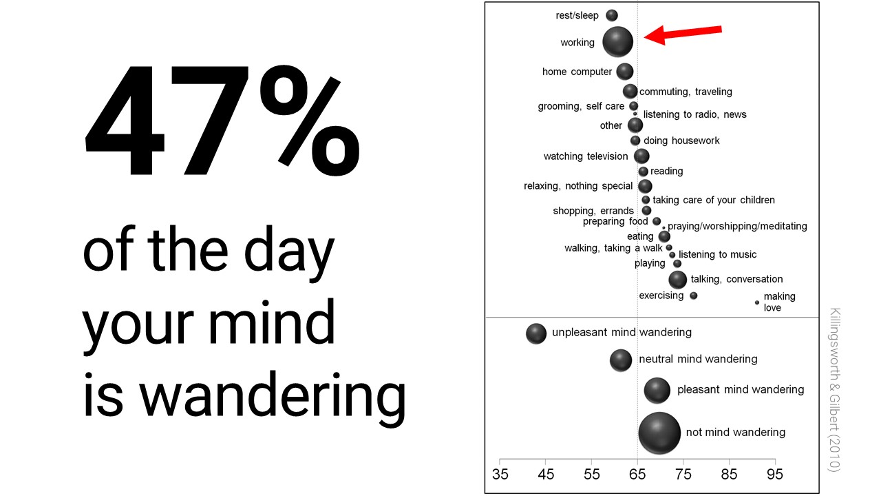
We humans are a very distractible animals. We spend 47% of our day distracted by other things. And we are most distracted at the times we are trying to concentrate the most!
This makes maintaining attention even more difficult in learning environments, because we will naturally seek out distraction.
For example, kids in decorated classrooms performed 25 – 35% poorer on tests because of the easy distraction from the environment. Interestingly, even without environmental distraction, kids simply switched to being distracted by each other.
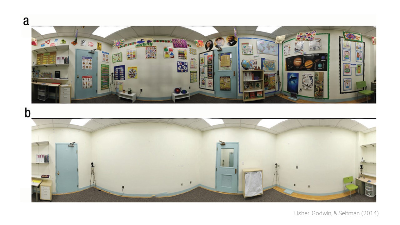
In the case of classrooms, there are likely many other benefits of busy classrooms that outweigh the distractions they cause. But in the short span of a presentation intended for adults, we should be aiming for the starkest, least distracting design.
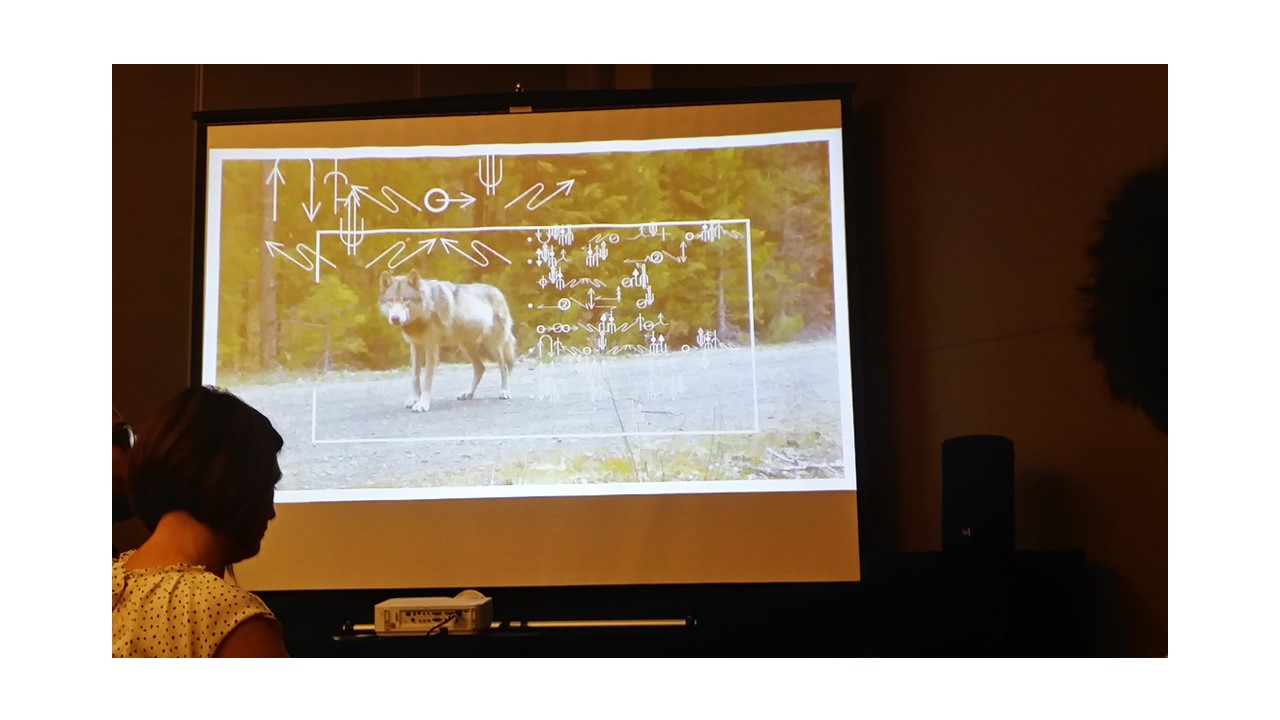
Just to drive home my point that we humans are overly distractible, look at the next slide and time how long it take you to find the let “O”.

Now try it again with the next column.
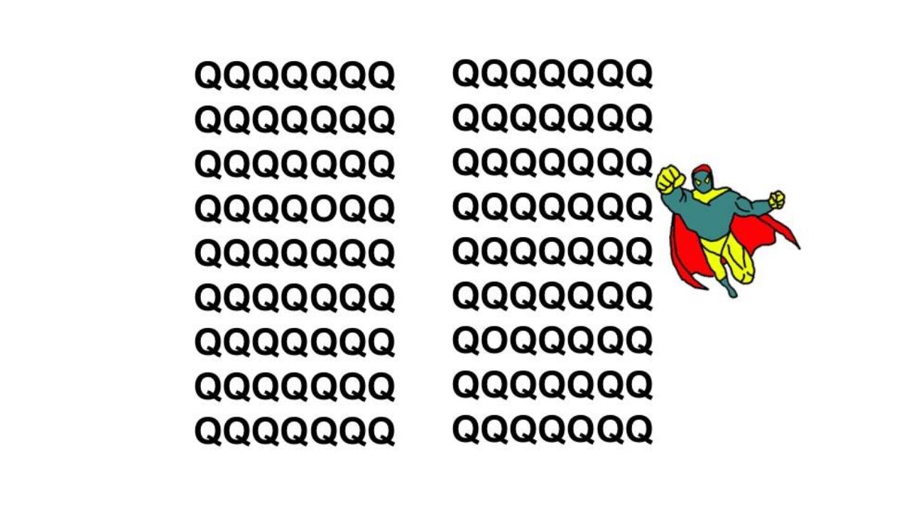
When researchers repeat these kinds of tests over and again, they find that just adding a simple distraction, like the cartoon, substantially increases your processing time because your mind splits your attention to processing the distracting image.
So, given what I just told you about how easy it is to distract a human, what is wrong with this fictitious but typical academic style slide?
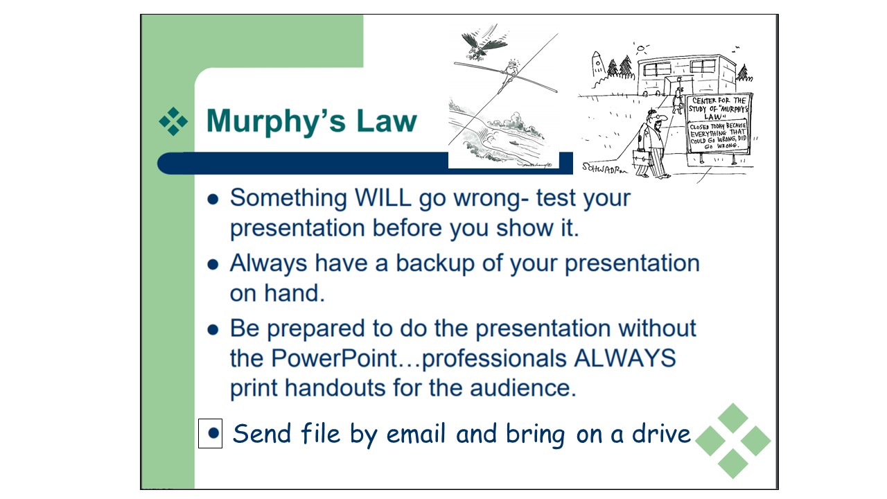
The problem with this type of slide is that there is too much going on. Even the most aggressively wielded laser pointer will not be able to focus the audience’s attention to one element at a time without distraction.
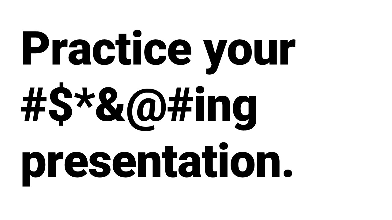
It is also important to remember that even the best story can be ruined by a bad storyteller. Poorly practiced and desultory presentations can be a huge distraction. So, in addition to minimizing visual distractions, remember to…
In the next section, I will go over some pointers and presentation hacks to avoid slides like this one.
Using figures
Academics love to put up complex figures with loads of distracting and unnecessary information on slides. Which kind of makes sense, really. After all, you spent hours collecting each little point of data, so to you, every data point is important. But that’s often not the case. Our goal with figures is to tell a story. It’s not to show off how much work we did, or how complicated our designs are. We want to distill our figures down to the smallest possible story units.
Take a look at this figure from an “experiment” I conducted. For this fictitious experiment, I was interested in how beard color and length correlates with crossword completion speeds. I went to 16 towns. In each town I gave 100 bearded folks a crossword and recorded how many cells they completed per minute and measure their beard length. In every town, half the folks had red beards and half had brown. I noted if they had proper beards or goatees (type).
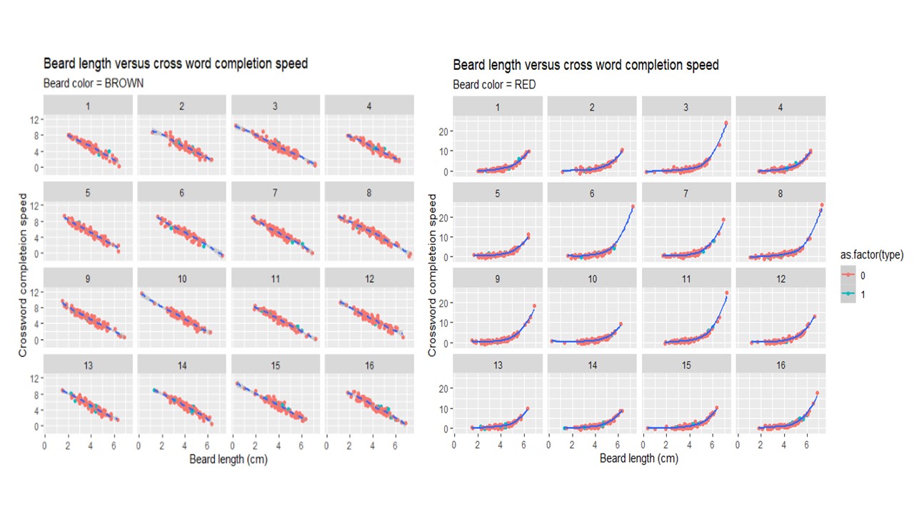
Think about the minimum units of the story here. What are some ways you might be able to make this figure simpler and less distracting?
Here is my revision. All of those original cells told basically the same story. And this image answers my primary question: “How does beard length and/or color impact crossword speed?” There is no need for the other information in the figure.
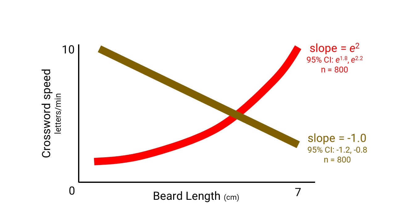
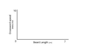
Now, here is how I would present this slide. I do it in layers, starting byexplaining the axis and what we should expect to see.
Then we layer on one bit of information.
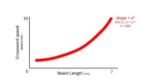
Then the next bit of information.

But there are some times when distilling down all of the information into one figure is difficult or doesn’t answer our question.
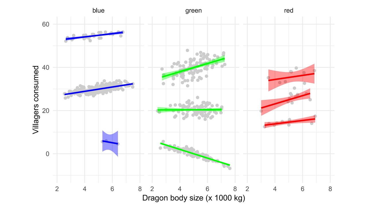
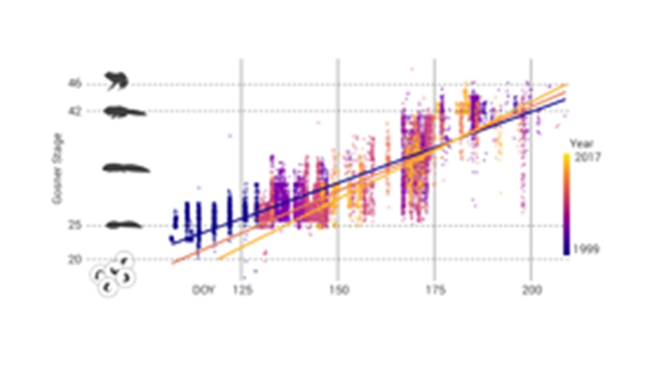
In this next fictitious experiment, I wanted to know if dragon size correlated with the number of villagers eaten. I recorded three different species of dragons in three different years (years is in time from present).
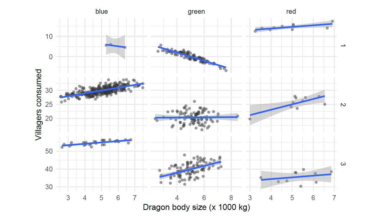
In this case, there is no obvious story–the relationship changes between years and with different dragon species. Also, our sample size are very different, so we need to have a way of relating that we are more confident in some relationships than others.
Here is how I decided to tell this data story.
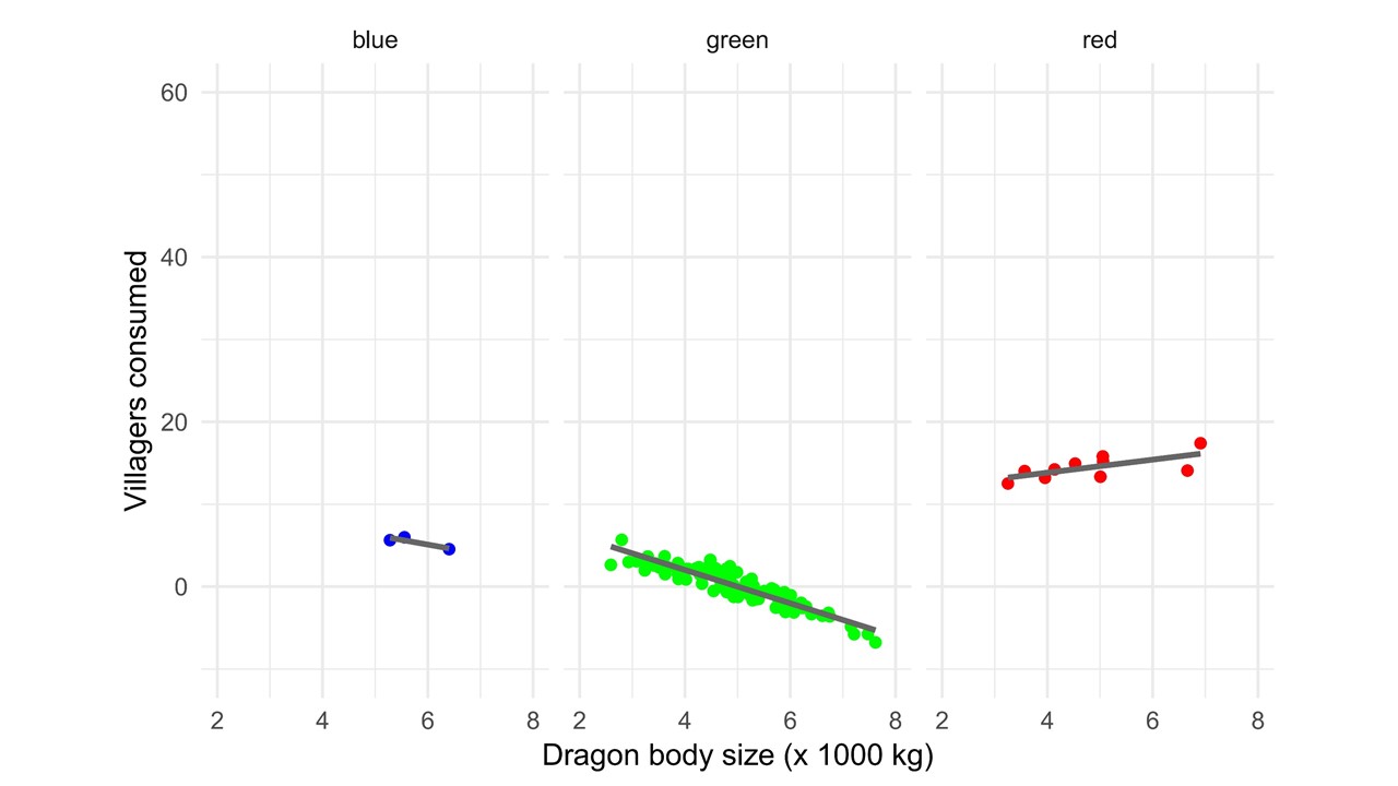
First, I start with the blank axis and explain what they mean.
Then I add the first year of information.
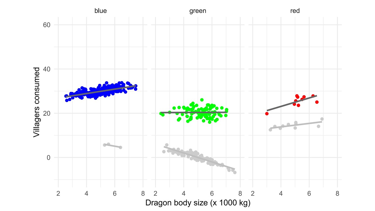
Then, I add the second year of information. But I still want folks to see the prior information, so I use selective highlighting to focus their attention. We can see that in all cases, more villagers were consumed. And the rate of growth increased.
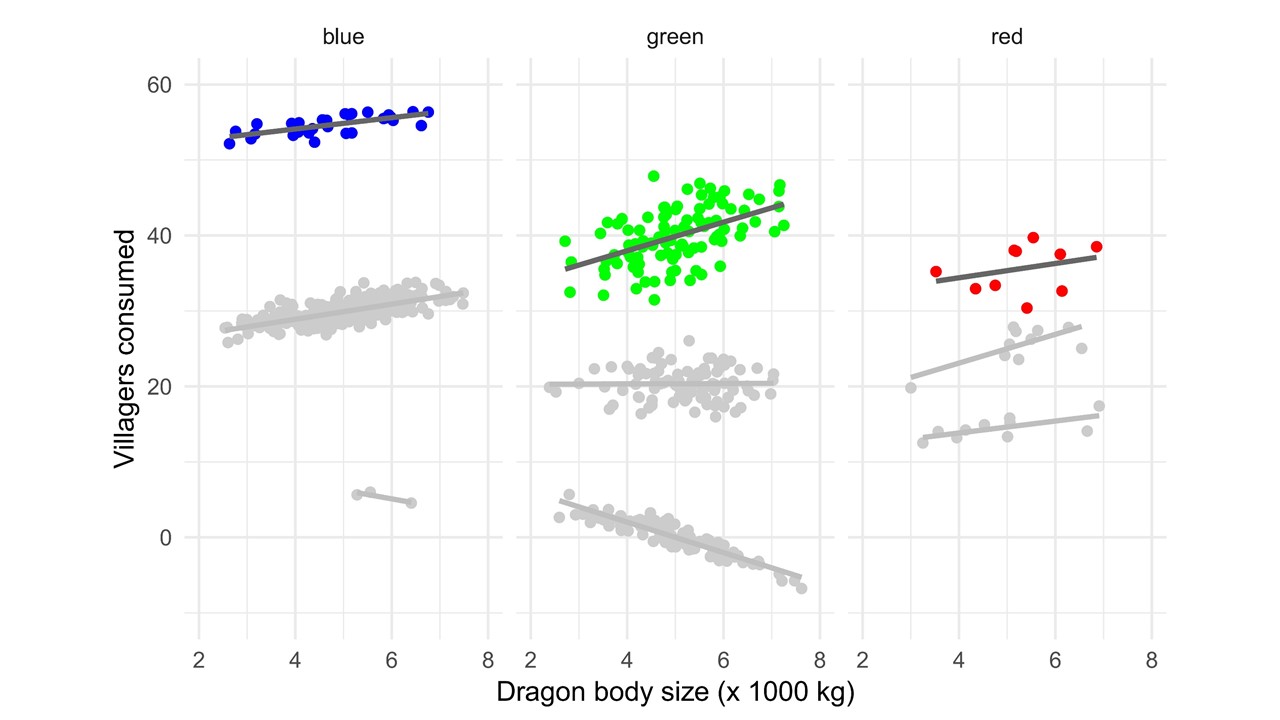
Now we add the third element. And we can tell the whole story. Every year, dragons eat more villagers, but species differ in the level of increase. Also, the relationship changes over time with respect to body size for different species of dragon.
To recap the whole story, I might show just the trends lines and confidence bands.
It can be really hard to strip down figures, especially if you are afraid that someone might question your data. When I make presentations, I always keep all of my original figures in extra slides at the end of my presentation, after the conclusion slide. I never show those slides in the presentation, but if someone asks a specific question about the data, I can easily flip to the more informative figure.
Other trick and tips
You can use the same kind of selective color to focus attention with text, too.
I also want to touch on some problems that I see too often and tell you how to avoid them.
Have you ever seen a presentation that looked fine on your computer, but came out looking like this at your conference talk?
This happens when you use a font on your computer to make a presentation that is not installed on the computer that you use to display the presentation. The computer defaults to what it thinks the next closest font should be, and it is always wrong.
The easiest solution is to simply export your slides as JPEG image files and put each one back onto a slide. Essentially, your slide is now a picture of your original slide. That way, it will be displayed exactly as you see it on your computer wherever you display it.
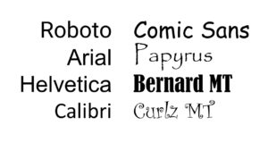
One quick word while we are talking about fonts. Please try to pick simple fonts (like those on the left). You should only use the fonts on the right if you are creating a title page for your 5th grade history report.
Have seen presentations with figures that look like this?
This happens when you enlarge an image in bitmap format. Essentially you are trying to display more pixel than in the original image. The computer interpolates new pixels by averaging adjacent pixels, but it is fuzzy and pixelated. The solution here is to either use vector based images or bitmaps that are as large or larger than the display size. If you are using an image from a paper, try to download the largest image size. If you can only take a screen shot, be sure to blow it up as large as possible before capturing the screen.
And in conclusion…
Please don’t do this at the end of your presentation. No one needs to know every organization that has ever given you money. And it is great to thank people, but if everyone is special, no one is special. Instead of making your final slide into a Guess Who board, consider alternative options to show gratitude. For example, if an undergrad was integral to an experiment, pop up their photo on the results slide and thanks them then. If an advisor was especially helpful, they’ll appreciate a handwritten thank you note more than a pixelated mug shot at the end of your presentation.
Keep your conclusion slide simple. Use the final slide to give your audience ways to learn more. For instance, I try to make a blog post about my presentation that folks can use to find out more information, check out my references, or see my original figures.

Good luck and happy presenting!