Last week, I attended a talk at our local Yale data science group by my friend Matteo in which he presented an overview of ggplot2. During the questions after the talk, someone asked how you can plot your own models with ggplot. I realized that this is a very important question that is often overlooked in ggplot tutorials. Sure, we can slap on a smooth to any ggplot, but as academics, we actually need to know the mechanics of the model. Most often, we start by modelling a relationship first, and then want to visualize the relationship for the specific instantiation of our model afterward.
Below, I will go through an easy method for simple linear models and a slightly more involved method that can be generalized to any model framework. In this post, I only address fixed-effect models, but I intend to cover mixed-effect models, which incur some extra concerns, in a future post.
We’ll begin by setting up the environment: loading in the tidyverse and the mcgv package for additive modelling. I also like to reset the default ggplot theme to something less ugly.
library(tidyverse)
library(mgcv)
theme_set(theme_classic())
We’ll simulate a fake dataset in the form of a linear relationship with intercept of 2 and a slope of 0.2.
X <- data.frame(x = seq(0, 20, 0.1)) %>%
  mutate(e = rnorm(nrow(.), sd = 0.5),
         y.lm = 2 + 0.2*x + e)
As mentioned, it is easy to slap a linear fit onto a ggplot with geom_smooth(method = 'lm'). Under the hood, ggplot is running a linear regression and estimate the fit and confidence intervals for us.
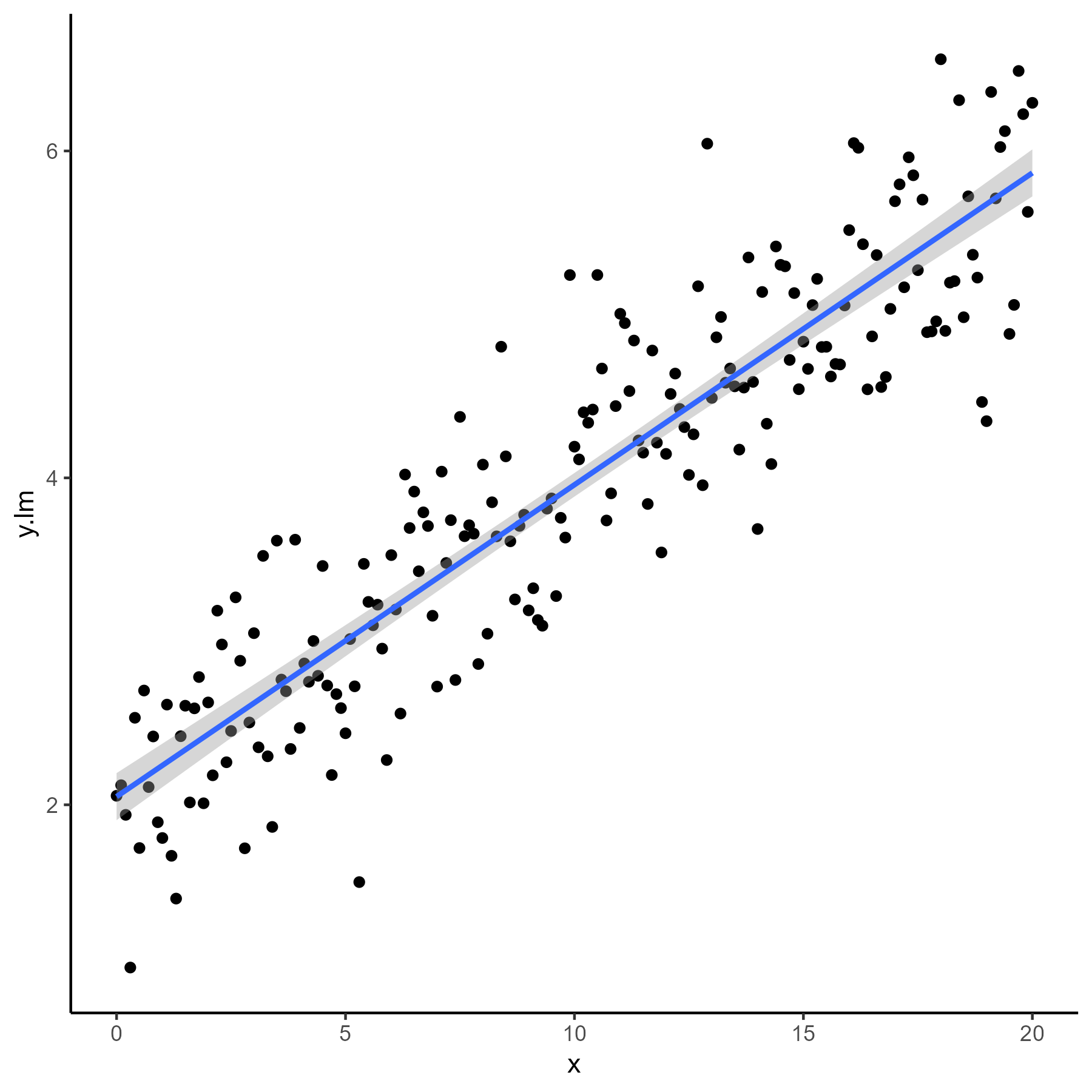 But, what if we want to fit our own model and then visualize it with ggplot? As simple solution for a linear model is to directly pass the model coefficients to
 geom_abline.
lm.fit <- lm(y.lm ~ x, data = X)

X %>%
  ggplot(aes(x, y.lm)) +
  geom_point() +
  geom_abline(intercept = coef(lm.fit)[1], slope = coef(lm.fit)[2])
However, this method is limited. It doesn’t allow us to include confidence bands, nor does it allow us to plot anything other than a linear fit.
Let’s say that we have a non-linear model. To simulate this, we will fit a polynomial (which is actually still a linear model in the sense that y is a linear combination of the degrees of x).
X <- X %>%
  mutate(y.nlm = 400 + 0.4 * (x - 10)^3 + e*100)

P1 <- X %>%
  ggplot(aes(x, y.nlm)) +
  geom_point()
P1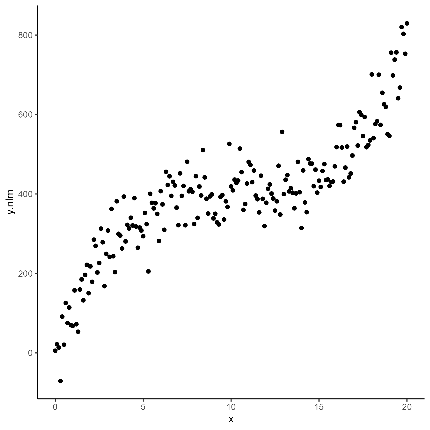
In real world scenarios we would not know the functional form when viewing the data and might decide to fit an additive model or a locally smoothed regression.
gam.fit <- gam(y.nlm ~ s(x), data = X)

loess.fit <- loess(y.nlm ~ x, data = X)
The easiest way to visualize the direct results of these non-linear models is to create a prediction data frame with x values that evenly span the range of our data. We can then predict the model fit for these points and use them to plot the line. This is also the most generalizable solution that will work with any model framework.
First, we create a new dataset with a range of x values. Then ,predict the fitted y values from our models.
newX <- data.frame(x = seq(min(X$x), max(X$x), length = 100))

newX <- newX %>%
  mutate(pred.gam = predict(gam.fit, newdata = newX),
         pred.loess = predict(loess.fit, newdata = newX))
To visualize the model, we simply plot the points from the initial dataset, then pass the new dataset into the data argument for geom_smooth. Note that we also need to pass our new y variable to the y argument of aes as well.
P1 +
geom_line(data = newX, aes(y = pred.gam), col = "dodgerblue", size = 2) +
labs(y = "GAM fit")
P1 +
geom_line(data = newX, aes(y = pred.loess), col = "firebrick", size = 2) +
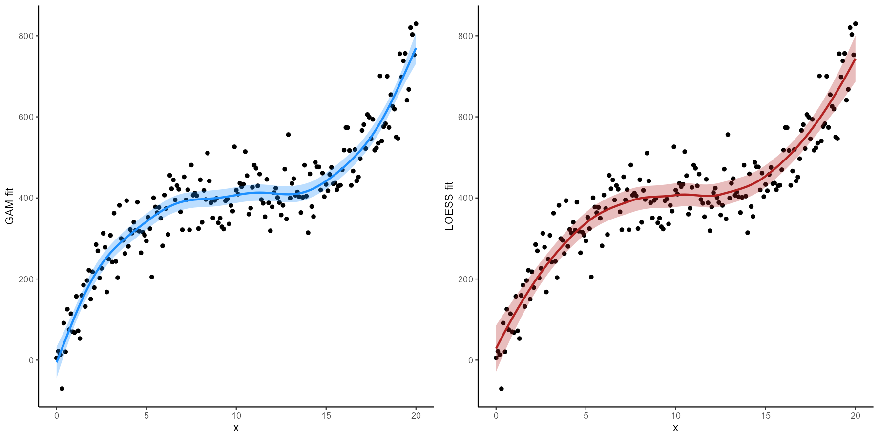
labs(y = "LOESS fit")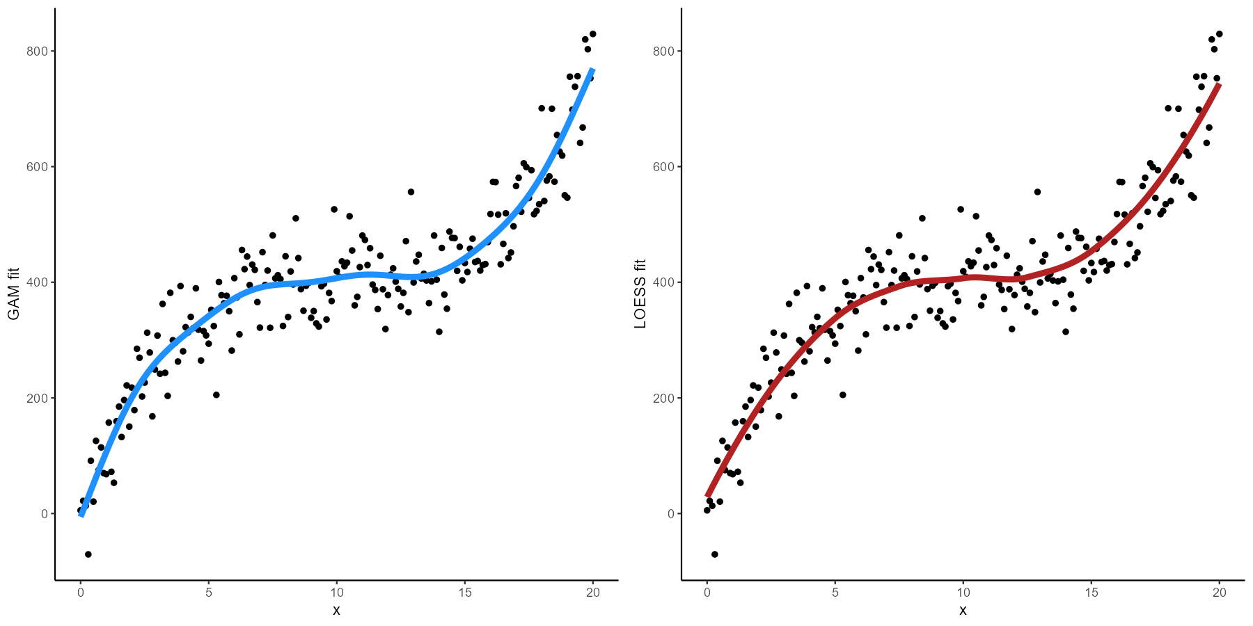 We can also use our model to estimate confidence intervals to use in plotting error bands.
newX <- newX %>%
  mutate(pred.gam.se = predict(gam.fit, newdata = newX, type = "link", se.fit = TRUE)$se.fit,
         pred.gam.lo = pred.gam - (1.96 * pred.gam.se),
         pred.gam.hi = pred.gam + (1.96 * pred.gam.se),
         pred.loess.se = predict(loess.fit, newdata = newX, se = TRUE)$se.fit,
         pred.loess.lo = pred.loess - (1.96 * pred.loess.se),
         pred.loess.hi = pred.loess + (1.96 * pred.loess.se))
P1 +
  geom_line(data = newX, aes(y = pred.gam), col = "dodgerblue", size = 1) +
  geom_ribbon(data = newX, aes(y = pred.gam, ymin = pred.gam.lo, ymax = pred.gam.hi), alpha = 0.3, fill = "dodgerblue") +
  labs(y = "GAM fit")

P1 +
  geom_line(data = newX, aes(y = pred.loess), col = "firebrick", size = 1) +
  geom_ribbon(data = newX, aes(y = pred.loess, ymin = pred.loess.lo, ymax = pred.loess.hi), alpha = 0.3, fill = "firebrick") +
  labs(y = "LOESS fit")