When I first started in communications, data viz was hard. You basically had to have a serious knowledge of Adobe Illustrator and Photoshop. At that time, “New Media” was just coming into vogue. We don’t even use that term anymore. Now, all media is new media.
Today it is trivial to make really sexy graphics in a few clicks and keystrokes. But the ease of creation also makes it much easier to produce poorly planned or spurious outputs. It also means that the marketplace of people’s attention is now flooded with loads of other eye-catching data visualizations to compete with.
Now, more than ever, it is important to think strategically about how to present your work. This blog grew out of a guest lecture I gave. It is intended to present some conceptual tools to help you make your data stand out.
To data viz or not to data viz?
Making a stellar data visualization takes time and effort. Even a simple plot for a scientific paper can take a while to get to the final print-ready stage. So, for starters, it is worth considering just how much time your particular data viz project is worth.
It is really easy to go deep into a rabbit hole making a beautiful visualization, or even an entire data storytelling project, only to have it sit on your computer or collect digital dust in some dark corner of your blog. My most adamant piece of communications advice is that you should spend just as much time planning how to outreach your work as you do creating it. And after you’ve got your product, you should again spend the same amount of time actually making sure that people see it. (This rule applies less to journal figures since the outlet is predetermined, but you should still plan to spend as much time sharing your hot-off-the press manuscript with your stunning figures after it comes out.)
Data visualization or data storytelling?
When people think about great data visualizations, they often think about the flashy and interactive products like those from the Washington Post or New York Times. I also love these interactive visuals, but to me, they are something more than data viz–they are data storytelling. Rather than simply displaying data, data storytelling integrates data as a part of a larger narrative. Good data storytelling involves skills that overlap with data viz, but add much more. For instance, my friend Collin’s Story Map of his research on lizards evolving to hurricanes is a great example. We learn all about his research and how he produced his data, but very little about the data itself.
In this article, I want to focus narrowly on data viz and how we interpret statistics visually. There are loads of plot forms that you can use, and folks are always coming up with new ways to use them, so rather than create an exhaustive list, I want to consider when and how we use data visualizations.
One quick caveat here: data viz implies that the only way to interpret data is with sight. But there are some really cool projects that display data without visuals, like my friend Lauren, who translated Alaskan tree loss through sound.
Grabbing your attention or focusing your attention?
One of the first questions to ask yourself in defining the purpose of your visual is: am I trying to grab folks’ attention or do I want to focus their attention? Humans brains are not all that well designed for sustained attention (I go in depth about this in my presentation about scientific presentations), so most of our task as science communicators is simply managing people’s attention spans. Flashy and interactive visuals are great for catching your audience’s eyes, but can be a distraction from carefully interrogating specific trends in data because there is too much to focus on. On the flip side, an equally beautiful but more subdued plot can perfectly highlight a specific point you want to make about your data, but folks might flip or scroll right past it if they are not actively interested. Considering your audience is paramount. For example, in a paper, I may include lots of information in a plot, but when I present my work in presentation form at conferences, I completely strip down my figure to their most basic elements.
One of the reasons we have short attention spans is that our brains have evolved to process lots of information quickly. As a tradeoff, our brains take cognitive shortcuts. If we are clever, we can use visualizations to hack our brains and leverage those shortcuts. As an example, take a look at the two images below. Can you tell which image of stars is randomly placed? Can you tell which set of numbers is random?
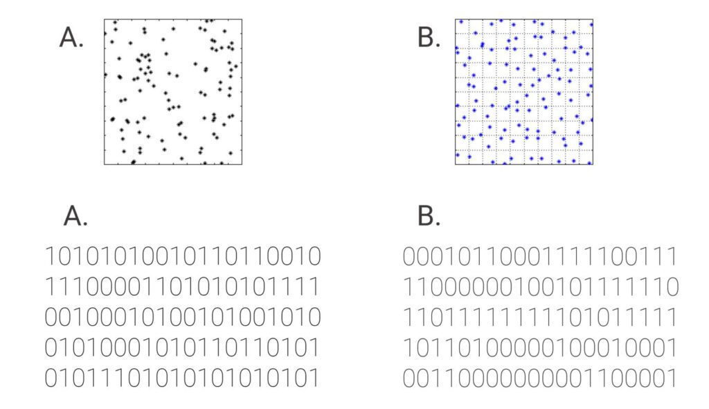
Human brains are overly tuned to seek patterns. Often, we see patterns when none are there (maybe this is where human predilection for superstition, conspiracy theories, and religion come from). Most people think that the blue stars (B) and number string A are the random sets. That is because we tend to see too much pattern and clustering in the black stars and too many patterns of repeats in number string B. When we see patterns, we assign meaning. In fact, the black stars are randomly placed (the blue stars are overly uniform) and number string A is randomly generated.
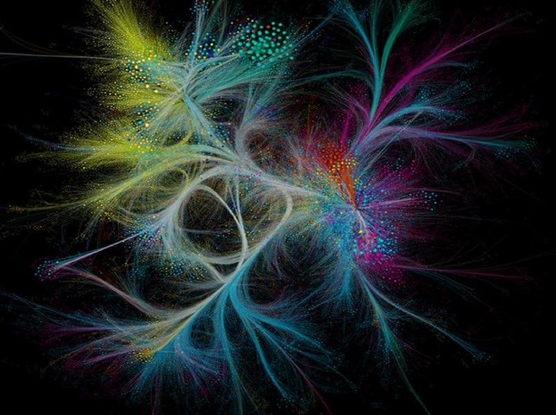
This is convenient for data viz, because it makes it easy for us to see trends in complicated data. For example, when Nature plotted all of it’s published papers over the last 150 years, and then linked them by citations, the result was incredibly complicated. But our minds tune-out most of the noise and instead focuses in on the major groups where fields merge.
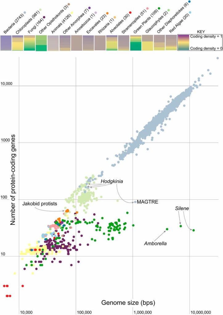
On the flip-side, our minds are quick to spot deviations from patterns, too. For instance, when Campbell et al. plot coding density versus genome size, it is easy to spot the clade of endosymbionts (in green) that deviate from the trend.
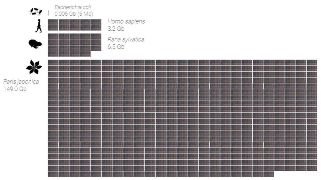
Our brains are also really bad at conceptualizing large numbers. For instance, if I told you that humans have about 3.2 billion bits of information in every cell of your body, but E. coli has just 5 million, and Paris japonica flower has almost 150 billion, the scale might be hard to grasp. But if I compare your genome to the letters in an encyclopedia and visualize the difference, the disparity is clear.
Making visuals that strategically hack our brains.
When it comes to visuals, I don’t like prescribing rules. Aesthetics change too quickly. Instead, I think it is more helpful to be strategic about the content of your visuals and treat the aesthetic refinement as an artistic process.
Scott Berinato’s book Good Charts comes from the perspective of management rather than science, but is, nonetheless, one of the best examples I’ve found of thinking strategically about making visuals. Berinato thinks that visuals fall on two intersecting gradients: Conceptual versus Data-driven (are you dealing with ideas or statistics?) and Exploratory versus Declarative (are you looking for a pattern or are you showing a pattern?).
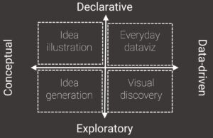
1. Everyday data viz
Usually, when we think about data viz, we are thinking about graphics that fall into the upper right quadrant, data-drive declarative graphics, what Berinato calls “Everyday data viz.” The purpose of these graphics is to highlight specific facts about our data. Most of the figures from scientific papers fall into this category.
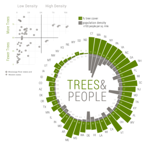
Within the “everyday data viz” category, there lies a wide range of visualization goals that depends on the intended audience. For example, I made a mirrored radial barplot comparing population density to tree cover. Wrapping this plot into a radial form makes the data more interesting, but actually makes it more difficult to read. If I were to include these data in a scientific paper, I would probably use a dotplot like the one in the top left of the figure. The dotplot displays the same information in a way that is more conducive to quantitative comparison.
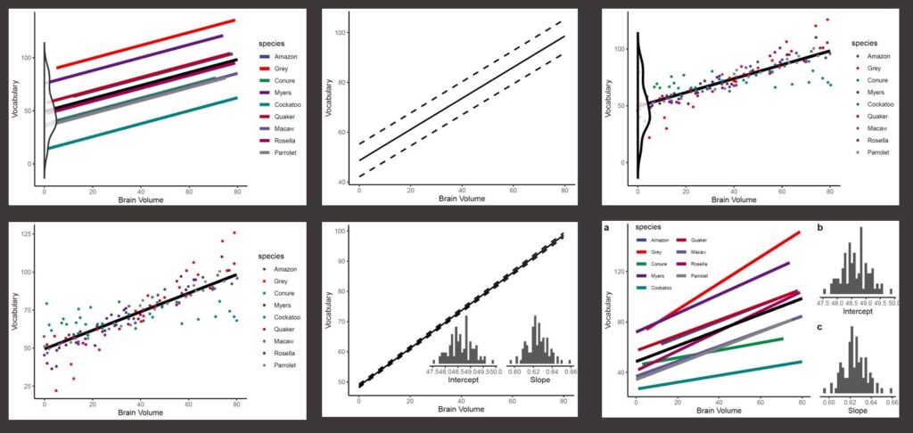
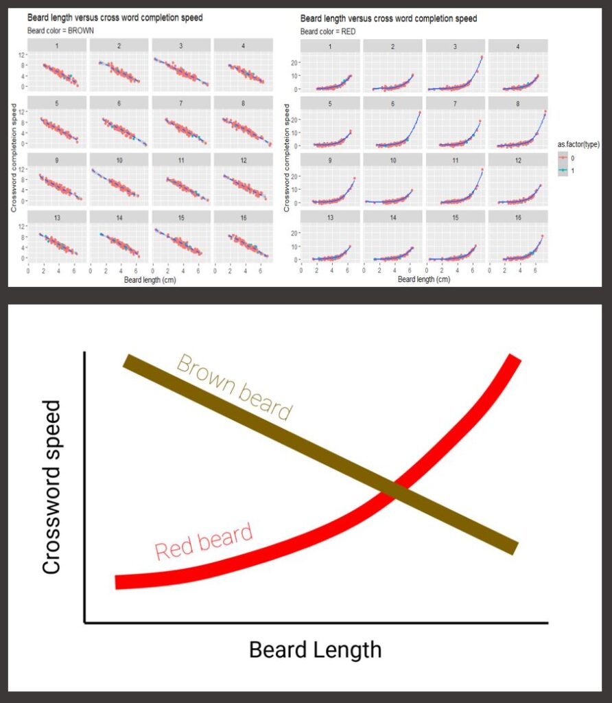
With these types of visuals, there is often a tradeoff between simplicity and aesthetics. Usually, simpler is better for scientific audiences. However, sometimes the whole point of a graphic is to demonstrate complexity or variation in the data. For instance, a simple mixed model regression could be easily displayed as a single trend line.
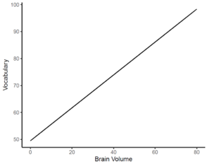
Not only is this super boring, but it misses one of the points of mixed models, which is how we deal with variation in the data. Below are six examples showing the same trend while highlighting the variation in the data in different ways.
On the other hand, when giving scientific presentations, we want to highlight the main trend without distracting the audience with noisy variation. In a prior post, I used the fake example below, where the most important trends (bottom figure) are completely buried in the meaningless distraction of too much information (top figures).
My main point here is that you must be strategic about who your audience is and exactly what you want them to take away from your visuals. It is unlikely that anyone will think as carefully about your graphic as you have. Instead, most folks will take away a fraction of the information you present. So, it is worth being as parsimonious as possible with the content in your graphics. One tip for presentations is to step away from your computer and squint your eyes–if you can’t make out the main trend, you probably should strip it down. Another tip is to start with the bare axis and explain them to your audience before showing the content of the plot. This way, they already know what to expect and they will not be as distracted trying to conceptualize what the graphic is saying.
2. Visual discovery
The graphics in the upper right quadrant of Berinato’s diagram are like the perfected Pintrest versions of our visuals. Before we get to that point, we will probably plot a ton of graphs as we analyze our data that no one ever sees. Berinato calls these graphs “visual discovery.” They fall in the lower right quadrant of data-driven exploratory plots.
As we explore our raw data, it is useful to hack our own brains to discover hidden patterns in our data. Most data is multidimensional and too complex to see every relationship at once. So, we check for relationships among variables and among subsets of variables. This process is usually iterative. The point isn’t to make perfect, pretty graphics–the point is to wrap our minds around the data.
One of my favorite examples of visual discovery involves one of the oldest examples of data viz.
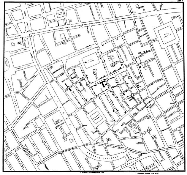
In the mid 1800s cholera was sweeping into London. At the time, few understood how the disease was transmitted. John Snow (no, not that John Snow) a medical doctor decided to plot the cases as bar charts of the number of victims at each address on a street map of the city. The map showed a public well at the center of the epidemic. The map helped Snow convince skeptical municipal authorities to close the well and effectively ended the outbreak.
Visual discovery is what scientist probably spend 80% of their analysis time on (I certainly do). Plotting programs like Rstudio or MatLab (and to a lesser extent, Excel) make it really easy to play with lots of ways to see our data and easily iterate to narrow in on interesting trends.
3. Idea illustration
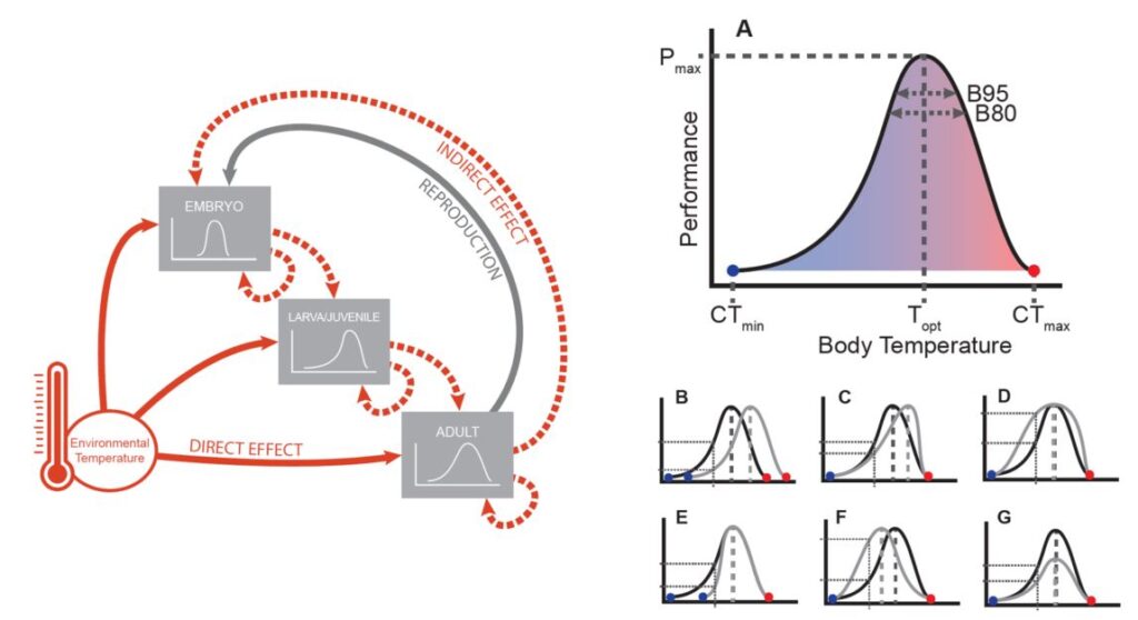
The top left quadrant, conceptual and declarative, Berinato calls “Idea illustration.” These are usually heuristics, flow charts, or diagrams with the purpose of visually demonstrating a complex idea in picture form. Scientists use these type of graphic often in review or synthesis papers. For example, I made the figures below for a recent review paper of herp thermal evolution. Neither are based on data. The first demonstrates a theoretical process. The second illustrates what real data might look like and how to interpret them. These types of graphic hack the map reading tendencies of our brain or prime our natural pattern seeking.
4. Idea generation
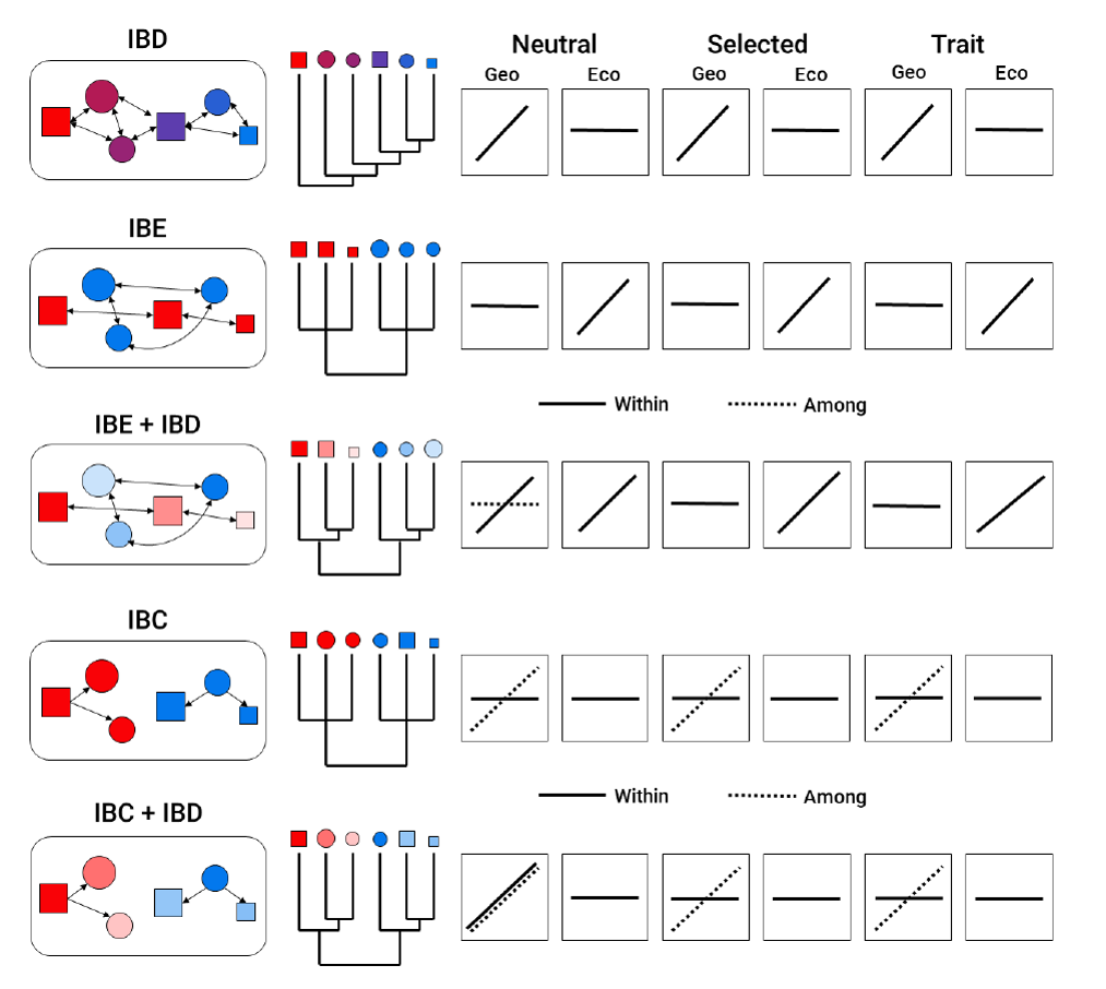
The lower left quadrant, Berinato calls, “Idea generation.” These are the kinds of figures scientists scribble up on white boards when we are thinking through experiments. Rarely do these graphics make it out into the world, rather they help us think through our own ideas. However, sometimes conceptual, exploratory graphics are useful for thinking through hypotheses. For example, I included the graphic below in my dissertation prospectus as a way to think through how geneflow patterns might look in different populations.
Understanding why and how it makes sense to use graphics can save you loads of time, keep you from making spurious plots, and may even lead you to a new discovery. Fortunately, professional plotting tools like (R and GIMP2) are freely available. So get out there and start making something beautiful and useful!